
(Our thoughts and prayers go out to the residents of Moore, Oklahoma and to all the other 30 million people rendered homeless by an expanding series of weather emergencies across the globe.)
Human caused warming is a global impact. It heats the atmosphere, it melts ice, and it warms the oceans. Yet, often, we find ourselves squabbling with an increasingly inane, irate and out of touch set of climate change deniers over one third of this equation: atmosphere. And even though evidence of inexorably increasing atmospheric temperatures, worldwide, is enough to bury any climate change contrarian under a mountain of facts almost as large as the 800 cubic kilometers of ice that melted from Greenland last year, it is still worthwhile to look at all these systems and see how they are responding to human warming.
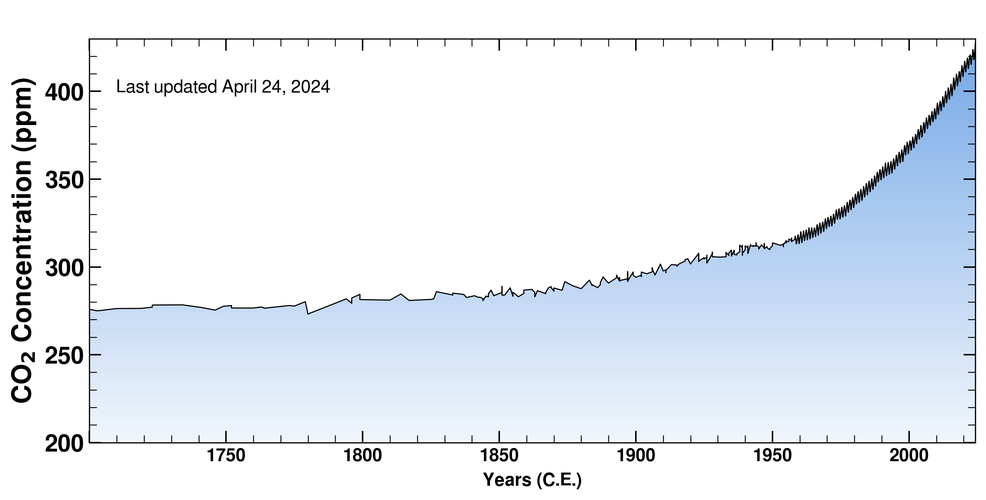
CO2 Rise
This week, CO2 levels averaged just a hair shy of 400 parts per million, a level not seen since the Pliocene, 2-4.5 million years ago. During this time the atmosphere was much warmer, there was much less ice, and ocean levels were much higher. Long-term, if atmospheric CO2 levels remain at 400 parts per million or higher, the least we can expect is about 3-4 degrees Celsius of warming, almost all Arctic ice gone, and sea levels about 75 feet higher than they are today.
CO2 is the most powerful long-term governor of atmospheric temperature. It has been compared to the control nob on the Earth’s global thermostat by atmospheric scientists. In the past, as CO2 rises, so does global temperature. If CO2 falls, so does temperature. If there’s no CO2 in the atmosphere, all water vapor falls out and freezes, leaving Earth as a snowball. If most of the atmosphere was composed of CO2, Earth would look a lot more like Venus. So, in short, it’s established that rising CO2 means increased warming.
What’s most important to our current exploration is that CO2 levels are rising. And what that means is one thing — the Earth will warm. How will this happen? The atmosphere will heat up, the oceans will warm, and ice will melt.
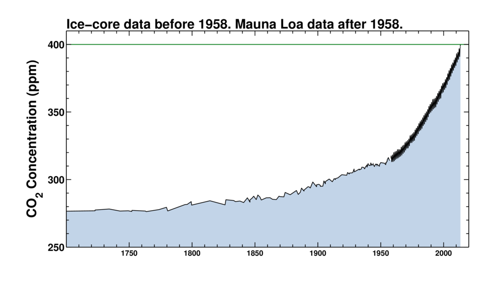
(Image source: Keeling Curve)
In the above graph, we can get an idea of how much and how rapidly CO2 has risen over the past 300 years. In the 1700s, human carbon emissions were much less than today. England was one of the only countries involved in wide-scale use of the fossil fuel — coal. So CO2 levels remained about at a level equal to past inter-glacial of around 275 parts per million — a level that had been steady for over 10,000 years. Then, in the 1800s we began to see a gradual rise in world CO2 levels. Over the course of one century, CO2 increased from 275 to 290 parts per million as industrialization began to ramp up and use of fossil fuels became more wide-spread. This increase of about 15 parts per million CO2 over the course of a century was already about as fast as anything that had ever occurred in the geological past. If sustained over centuries, such a rate would be enough to push a powerful warming. But what happened next was catastrophic.
In the 20th century, worldwide CO2 went from about 290 parts per million in 1900 to around 375 parts per million in the year 2000. This rise of 85 parts per million over the course of a century was much faster than any rise in CO2 previously detected by scientists. What it represented was a powerful forcing pushing the world’s atmosphere, oceans, and ice sheets to ever greater levels of warming.
By the turn of the century, this increase in CO2 had already set off at .6 degree Celsius increase in global land and ocean temperatures, pushed the recession of a majority of glaciers around the world, caused sea ice area, volume and extent to begin to fall off, and set Greenland and Antarctica to melting. This initial punch was just the opener for a long age of Earth changes that were a result of human-caused climate change.
In the first 12 years of the new century, world CO2 levels continued to rise at ever-increasing rates. About another 25 parts per million CO2 was added to the global total and we are now poised to break the 400 part per million threshold. At this stage, land and ocean surface temperatures have risen by about .8 degrees Celsius, 9 out of ten glaciers in the world are receding, the rates of ice melt from Greenland and Antarctica are accelerating, and Arctic sea ice volume has declined by more than 80%.
Energy Imbalance
The power of CO2 to govern Earth’s temperature and, by extension, climate, rests in its heat-trapping characteristics. So as CO2 concentrations in the atmosphere have dramatically risen, the heat trapping characteristics of the Earth’s atmosphere have also increased. The result is that more of the sun’s radiation is being absorbed by the Earth than is being reflected back into space. This characteristic is called an energy imbalance.
Over time, this imbalance will be resolved by Earth warming, which will result in more radiation being sent out into space and equilibrium will again be achieved once a higher temperature is reached. Currently, the energy imbalance of the Earth is about .6 Watts per meter squared or enough to warm the Earth by about another .5 to .7 degrees Celsius before reaching equilibrium. So, in total, given the current energy state of the Earth’s atmosphere, we have at least another .5 to .7 degrees Celsius locked in over the next couple of decades even without further greenhouse gas emissions or the contribution of a number of amplifying feedbacks.
Heating the Atmosphere and Ocean Surface
The re-balancing of Earth’s energy will result in heating the atmosphere, warming the oceans and melting ice in the form of glaciers, ice sheets, and sea ice.
The first element, a warming atmosphere and a heating of the ocean surface has been well documented. As CO2 concentrations rose, atmospheric and ocean surface temperatures also rose. You can see this dramatic increase in global temperatures by looking at the following graph:
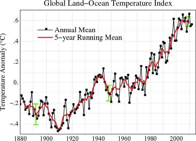
(Image source: GISS)
In short, rising levels of CO2 in the atmosphere continued to force global temperatures higher until they finally reached a .8 degree Celsius increase over the 1880s. This surface temperature increase is a powerful visible sign of global warming caused by human activity.
To wit, an increasing number of climate change deniers and contrarians are trying to argue that human caused global warming has stopped. To support this conclusion, they point to a ‘plateau’ in atmospheric temperature increases occurring over the last five years. To do this, they must ignore the fact that 2010 was the hottest year on record even as they continue to cherry pick data to support some rather obviously skewed conclusions. Others have claimed, using a curve fitting analysis that is unsupported by scientific evidence, that global temperatures will continue to plateau until 2040 when Earth will undergo another step increase to higher atmospheric temperatures. With forcing so high and greenhouse gasses increasing at such a rapid rate, such a conclusion is difficult to support without major ocean heat uptake or extraordinarily rapid melt of glaciers, sea ice, and ice sheets.
Even if such an event, however unlikely, were to happen, it would not signal that the Earth is cooling. A pause in atmospheric warming while the oceans continued to heat up and ice continued to melt does not a cooling world make. In order for the ‘cooling’ contrarians claim to be established, you would have to see a combination of atmospheric cooling, ice increase, and ocean cooling. In truth, what is happening and what continues to happen is exactly the opposite.
The larger fact is that the atmosphere is warming, remains at record high temperatures, and that Earth’s energy system remains out of balance even as CO2 levels increase. The result is that atmospheric temperatures will continue to increase as time moves forward. Most likely, the next El Nino year will break the record set just three years ago in 2010.
Warming Oceans
That said, it is worth noting that the lion’s share of CO2 forcing goes to work warming the world’s oceans and melting the world’s ice. As a result, atmospheric temperature measurements only take account of the tip of the human global warming ice burg.
The reason for this is that interplay between the Earth’s atmosphere and the ocean surface, heat transport of atmospheric heat through the surface and into the middle and deep ocean, and evaporation of water all serve as heat uptake processes that are not accounted for in the atmospheric temperature readings. So if you want to get a better idea of how rapidly the Earth is warming, you also need to take into account ocean heat content.
Until recently, there were very few comprehensive studies of ocean heat content. So most warming studies took into account only atmospheric heating alone. However, recent studies by Magdelena Balmaseda, Kevin Trenberth and others have opened a new field of middle and deep ocean heat measuring providing yet another overwhelming volume of evidence pointing toward a rapidly warming world.

(Image source: Balmaseda/Trenberth Study)
The above graph shows a very rapid ocean heat content uptake occurring in the period of 2000 onward. As a result, a greater portion of the world’s warming ended up in the oceans even as atmospheric temperatures continued to move higher. It shows an increasing pace of transfer of heat from the atmosphere to the ocean — a result of a steadily strengthening CO2 forcing.
When combined with atmospheric warming, these measurements show a powerful warming effect both on the atmosphere and on the ocean. The result is that it appears both are warming in steps.
One interesting point to make is that during the 1990s, the Earth’s atmosphere appeared to warm rapidly while ocean warming slowed. During the 2000s, the pace of atmospheric warming tended to be slower while ocean warming speeded up. It is likely that the pace of ocean heat uptake has a direct impact on the atmosphere and that these systems are involved in a complex dance as Earth warms.
For a long time, ocean turnover has been seen as a system that could slow global atmospheric temperature increases. Yet this inertia comes at the cost of more ocean evaporation. The result is that more water vapor ends up in the atmosphere. And since water vapor is a powerful greenhouse gas, the longer term effect would be greater warming. More ominously, warming oceans house a large volume of methane hydrate. In a world of warming oceans, a portion of this gas, now locked in icy formations on the ocean floor, is likely to be liberated. Since methane is a powerful greenhouse gas, its liberation will likely combine with increasing water vapor to push atmospheric warming higher.
Ocean turnover, heat absorption and warming, therefore, should best be seen as an inertia that, over the course of decades, has the potential to slow down human warming. That said, at least two major amplifying feebacks — water vapor and methane hydrates — also emerge to greater and greater degrees as the ocean warms.
So, in summary, what we have witnessed, thus far is both substantial atmospheric and ocean warming as a result of human CO2 increase. Now let’s look at the third system — the world’s ice.
Melting Ice and Evaporating Water
The final measure of human caused global warming impact includes phase changes between water and liquid and liquid and gas. This is an important measure because it takes energy just to change matter from one state to the next. For example, the energy required to melt ice at zero degrees Celsius is 334 kilojoules per kilogram. This extra energy required to melt ice without increasing temperature, represents an invisible barrier to temperature increase. A similar barrier lies between water as a liquid and water as a gas.
So any melting of ice takes up energy that would instead be used to heat the atmosphere or warm the oceans. As such a change in phase from solid ice to liquid water is one more sign that the Earth is warming.
For global ice melt, we have a number of rather comprehensive measurements: glacial melt rate, Greenland melt rate, Antarctic melt rate, and sea ice volume loss. Though no complete measure, as yet, has been assimilated to determine the total volume of ice lost each year, a combination of these measures can give us a good indication.
First, lets start with rates of glacial ice loss. Though no total volume measurement is given for all the world’s glaciers it has now been observed that 9 out of 10 glaciers are losing ice more rapidly than they are gaining ice. In almost all regions around the world, major mountain glaciers are rapidly receding, a sign that global warming is steadily advancing. Average glacier mass balance provides a good catalog of this change.
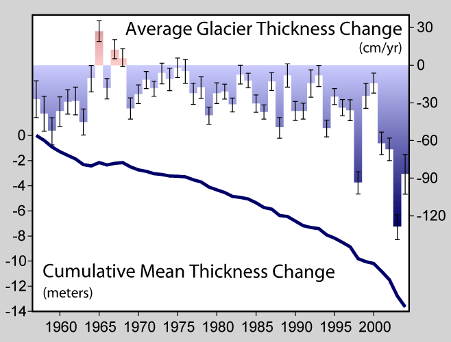
(Image source: Commons)
What the above image shows is that the world’s glaciers have lost, on average, about 14 meters of thickness since 1955 and are now losing mass at the rate of around 80 centimeters of thickness each year. Not only does this table show mass loss for glaciers continuing over time, it shows that the rate of mass loss is increasing.
These statistics only involve the world’s continental mountain glaciers. If we want to get an ever-clearer picture of the ice, we need to take a look at Greenland and Antarctic ice mass loss.
For Greenland, satellite measurements have shown an increasing decline in total ice mass over the past decade.
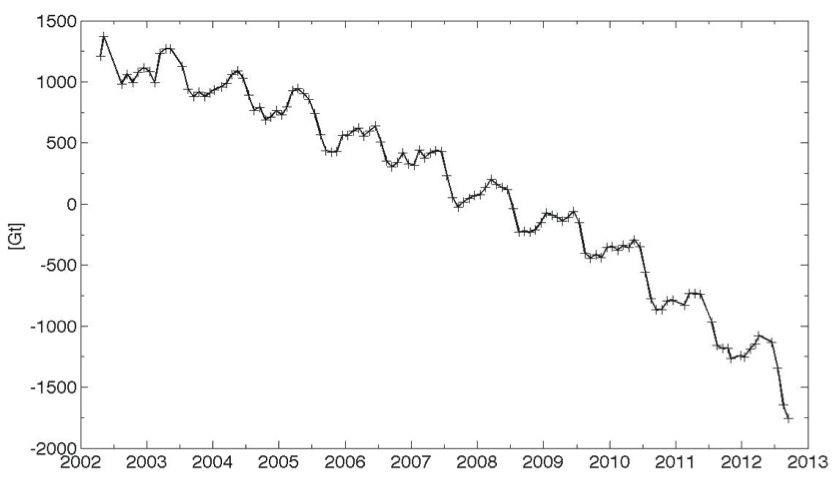
What the above image shows is an ongoing loss of ice since 2002 with the rate of loss increasing steadily through the start of 2013. Average rates of loss in recent years have been on the order of 500 cubic kilometers per annum, with a massive loss of about 800 cubic kilometers occurring between 2012 and 2013.
Antarctica has shown a similar rate of decline which, though slower than Greenland is still contributing high and increasing rates of ice melt.
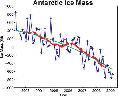
(Image source: Skeptical Science)
What has been shown is that this rate of melt for land-bound ice at both poles is rapidly increasing. According to a statement from NASA in November of 2012, the current rate of polar melt from Greenland and Antarctica is now three times the rate of melt during the 1990s (NASA statement here).
Moving on to sea ice, we find similar rates of loss in the northern hemisphere. In the southern hemisphere, we have a set of counter-trend circumstances that have resulted in modest sea ice gains.
Northern hemisphere sea ice is perhaps the most dramatic example of human caused warming in the form of ice melt. Sea ice volume has fallen by over 80% since 1980 with the pace of melt accelerating since 2000. The following graph provided by PIOMAS vividly shows this devastating decline.
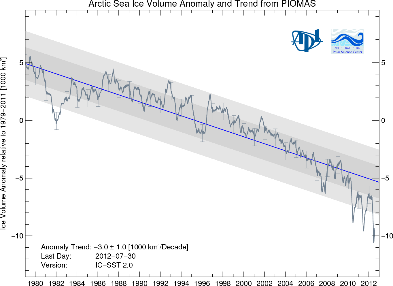
(Image source: PIOMAS)
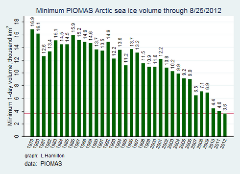
What these two graphs show is a loss of, on average, 750 cubic kilometers of sea ice in the northern hemisphere at the end of each summer. This high rate of loss adds to Antarctic land ice mass loss of around 300 cubic kilometers each year and Greenland mass loss of around 500 cubic kilometers each year.
Last of all, let’s take a look at Southern Hemisphere sea ice. Counter to the trend of melt in continental glaciers, Greenland ice, Antarctic ice and Arctic sea ice, sea ice area and extent in the southern hemisphere has been slowly increasing since the 1980s. The rate of increase is small when compared to similar measures of sea ice extent and area in the Arctic — about 1/3.
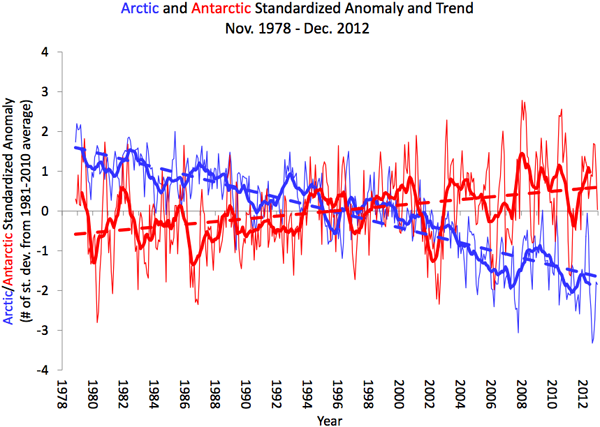
(Image source: NSIDC)
That said, it is important to note that air temperatures in the region of increasing Antarctic sea ice are increasing at rates even faster than around the globe. Furthermore, sea ice volume measurements for the Antarctic are sparse and difficult to come by. So we don’t really know if the surface is expanding even though the ice, in total, may be thinning. Furthermore, studies indicate that sea ice area and extent expansion in the Antarctic are driven by the melting of land ice. As the great glaciers of Antarctica have contributed an average of around 300 cubic kilometers of melt each year, this fresh water has extended around the Antarctic continent. The fresh water freezes at higher temperatures. Also, as the water is already near zero degrees Celsius, it takes less energy to freeze. Last of all, this fresh water cap tends to prevent warm water upwelling from the deep ocean. Such upwelling has tended to melt ice in this region and so the ice is somewhat protected from below by a shield of cold, fresh water.
Since we don’t have volume measurements of Antarctic sea ice, we can only assume that the slight increase in Antarctic sea ice extent and area over the past 30 years is also indicative of a small net increase in volume. If this is the case, it is the only area around the globe where ice is seen to be increasing. All other areas show rapid decline. And this larger trend is indicative of a massive amount of heat energy going to melt the ice.
So what we see, in combining the measures of continental glacier mass loss, Greenland glacial melt, Antarctic glacial melt, and Arctic sea ice melt is a rapid changeover of much of the world’s ice from solid to liquid state. This takes a huge amount of energy and is roughly equivalent to the energy that has gone into heating the atmosphere.
No Evidence That Global Warming Has Paused
When taking into account continued atmospheric temperature increases, increasing ocean heat uptake, and increasing rates of global ice melt, there is absolutely zero evidence that human-caused global warming has paused. Instead, we have seen a much more rapid impact on both the world’s oceans and on its ice over the past decade and a half. Further, though atmospheric temperature increase may have slowed somewhat over the same period, such a slow-down has come at the cost of an increasing pace of impact to both the Earth’s oceans and to its ice.
Moving forward, it will be worthwhile for scientists, researchers and environmentalists to continue to keep track of total Earth warming by gaining ever-clearer pictures of ocean heat uptake and worldwide ice melt while also keeping track of atmospheric temperature increases. In total, these provide a much more comprehensive picture of human warming. When taken together we can see that the human impact has been both rapid and powerful, with the pace of impact showing no sign of abating.
Links:
The Balmaseda/Trenberth Ocean Heat Study
Skeptical Science: Antarctic Mass Loss


