Killing Heat — It Felt Like 165 Degrees in Iran Today

In Iran it was 115 degrees Fahrenheit today (46 C). Add in humidity and the heat index was a stunning 165 F (74 C). But what they really should be concerned about is the wet bulb reading

A Limit to Human Heat Endurance

Thirty five degrees Celsius. According to recent research, it’s the wet bulb temperature at which the human body is rendered physically unable to cool itself in the shade. At which evaporation not longer cools the skin. A temperature that results in hyperthermia, heat exhaustion and heat stroke — even when sitting still and out of direct sunlight over the course of about 1-3 hours. Basically, it’s the physical limits of human heat endurance.

The primary factors involved in determining wet bulb temperature are atmospheric temperature and humidity. The temperature of an air parcel cooled to saturation (100 percent humidity). Basically, it’s the coolest temperature human skin is able to achieve by sweating.

One of the reasons why high heat and high humidity seem so oppressive is the fact that it interferes with water evaporating from your skin keeping your body at its natural temperature (98.6 F). High heat + high humidity means less cooling at skin level, which can result in a pretty rapid over-heating. We’ve all experienced it, that sense of stifling on a hot, muggy day. And there’s a bone-deep reason why it feels so bad. Hit a too-high intensity and it’s a killer.

Persian Gulf Heatwave

(An oppressive heat dome high pressure system settles in over the Persian Gulf. Image source: Ryan Maue.)

At 47 percent relative humidity and 115 degrees Fahrenheit, it felt like 165 degrees (F) today in Bandar Mahshahr, Iran. That’s a wet bulb temperature of 34.7 C. A temperature near the edge of human limits and the second highest heat index value ever recorded in any official or unofficial measure (the highest unofficial measure was 178 F). It’s the kind of heat that is, quite frankly, deadly.

Heat Dome Settles Over Persian Gulf, Sea Surface Temperatures Spike

Bandar Mahshahr sits at the Northern end of the Persian Gulf. A region of water that features some of the highest sea surface temperatures on Earth. Over the past week, an oppressive heat dome high pressure system began to settle over the region. Air temperatures around the Gulf hit well above 110 F in many locations. In Baghdad, they soared to 122 degrees F (50 C). Yesterday and today, the sea surface temperatures also sweltered — ranging as high as 34.6 C (94 degrees F).

Since ocean surface temperatures produce latent heat and determine the maximum moisture loading of the Earth atmosphere, maximum sea surface temperature is a good basic yardstick to determine if surface wet bulb temperatures are capable of hitting or exceeding the human survivability threshold at 35 C. And what we are seeing is that the near Persian Gulf region is steadily entering this dangerous range.

image

(Sweltering sea surface temperatures like those now visible in the Persian Gulf can support heatwaves that the human body did not evolve to endure. Image source: Earth Nullschool.)

As the heat dome continues to settle in over the next week, there is increasing risk to the people living in the Persian Gulf region. Some have access to cooled shelters, life saving ice and water. But many do not. At particular risk are the over 3 million Iraqis displaced by the violent conflict wracking that fractured state. Chronic electricity and water cuts throughout the region also lends to the overall vulnerability. It’s a current crisis. But it is one that occurs in an overall worsening context.

As the world’s oceans continue to be warmed by heat trapped through human greenhouse gas emissions,  sea surface temperature thresholds will be driven inexorably higher. The potential moisture content in the near surface atmosphere will rise and so will temperatures. This will increasingly generate heatwaves which the human body simply does not have the physical capacity to endure. Overall, this is one of the reasons we see more mass casualty events as a result of heatwaves — like the events occurring this year in Pakistan and India. It’s a case of pushing the atmospheric heat and moisture loading beyond human survivability thresholds. And we’re steadily doing that now. Let’s hope that this week’s Persian Gulf heatwave doesn’t add another hothouse mass casualty event to the growing list.

Links:

Physical Limits to Adaptation

Middle East Broils Under Extreme Heatwave

Iran City Hits Suffocating Heat Index

Earth Nullschool

Pakistan Heatwave Mass Casualty Event

India Heatwave Mass Casualty Event

Hat Tip to Robert in New Orleans

The Pace of Ocean Rise Yet Quickens — AVISO Shows Record Spike in Sea Level

According to a new paper out by James Hansen, human warming could force glaciers to melt so fast that seas rise by as much as ten feet in as few as fifty years. Ten feet in fifty years of business as usual fossil fuel burning. It’s enough to change the face of human civilization. To render many of our vast cities waterlogged wastelands as a tide of migrants flood inland to flee the all-too-real rise of the waters.

It’s a situation we really need to get a handle on. One we should be monitoring with increasing concern. One we should absolutely be trying to prevent by ramping down fossil fuel burning as swiftly as possible.

Over the past Century, global sea level rise has been following a steadily sloping curve. At the beginning of the 20th Century, rates of global sea level rise were a mere 0.8 millimeters each year. By mid Century, the rate had increased to around 1.9 millimeters. And by the first decade of the 21st Century, the rate had again jumped — hitting 3.3 millimeters. As of 2014, satellites above the Earth had sniffed out another jump in the rate of sea level increase. A surge in the pace of rising water spiking well above the 3.3 millimeter per year trend line. A potential warning sign that basal melt of ice sheets in Antarctica and Greenland was starting to have an ever-greater impact.

Sea leve rise AVISO July

(Largest spike in sea level rise since 1993 is now being observed in the AVISO satellite monitor. Image source: AVISO.)

For as of this past month sea levels had spiked to nearly one centimeter above the annual trend line. A record spike that, as yet, shows little sign of abating.

Other than glacial melt and thermal expansion of the oceans due to a continued accumulation of heat, there are a few other ocean and atmospheric features with the potential to wag the overall trend line. One of these is El Nino. And this year is likely to feature one of the strongest El Ninos on record. But the current spike is also the highest upward variance we’ve seen in the entire satellite record dating back to 1993. It’s a severe wag to the upside that’s worth at least a couple of raised eyebrows.

To hit Hansen’s 10 foot in fifty year mark, what we’d end up seeing is a doubling in the rate of glacial melt from Greenland and West Antarctica every 5-10 years. It’s an extraordinary pace of melting. A signal that should show up in the GRACE satellite sensors measuring gravity loss from the great ice sheets. This signal, however, would also start to show up in the global sea level rise monitors as a continued ramping up of the pace at which oceans are surging. And we can’t entirely rule out that we’re observing some of that quickening in the spike we see now.

Links:

AVISO

Warning From Scientists: Stop Fossil Fuel Burning or Age of Storms, Rapid Sea Level Rise is Coming Soon

Historic Rate of Sea Level Rise

Possible Strongest El Nino on Record


An Army of Firefighters Battles 14 Blazes in Triple Digit Temps Across California — More than 1,000 People Displaced

It’s becoming all too clear that we’re rolling with some seriously loaded climate dice.

California, suffering through its second year of a desiccating 1,000 year drought, is now facing down a new set of related tragedies. Over the past few days temperatures rocketed into record triple digit heat. The Golden State, turning more and more into the withered Brown State, faced hot Santa Anna winds and a new eruption of dangerous fires.

(A rash of California wildfires has now displaced more than 1,000 people — adding to the long tally of forced displacement due to extreme weather conditions related to human caused climate change. Video Source ABC News.)

According to news reports, 14 major fires are now absorbing the efforts of an army of 7,000 firefighters and California National Guard members. In total, more than 1,000 people have been displaced by the fires raging throughout Northern  and Central California. Ten structures, including homes, along with boats and vehicles, have been destroyed even as more than 300 are now threatened.

Of the most intense and dangerous fires, the largest fire covered 13 square miles in Lake County. That single blaze alone forced 650 residents to evacuate and destroyed two homes. As of late Thursday night, this dangerous fire was only 5 percent contained. Nearby, Brenna Island saw a brush fire tear through a mobile home park destroying six structures along with numerous boats and vehicles. In Nappa Valley, a 12 square mile inferno spread beyond containment lines to threaten 136 structures — forcing another 200 people to evacuate. Over on the shores of Bass Lake a fourth fire nearly doubled in side — surging from 3 square miles to five square miles in just one 24 hour period. As the Bass Lake fire encroached upon the Cascadel Woods community another 400 persons residing in approximately 200 homes were forced to flee. By early this morning, the rapidly expanding fire was only 30 percent contained.

California Wildfire Smoke

(A pallor of wildfire smoke lingers over Northern California as blazes erupt under sweltering heat and gusty winds. At right of frame also note that the mountain snow pack is basically nonexistent. Image source: LANCE-MODIS.)

By yesterday afternoon, smoke from these wildfires was beginning to show up in the NASA/MODIS satellite shot. A dark pallor and haze that is all-too-likely to expand over coming days as temperatures in the middle 90s to lower 100s (Fahrenheit — 35 to 41 Celsius in the metric conversion) are expected to remain in place through next week.

California Continues to Suffer Through a Climate-Change Linked Drought

Off-shore, a massive pool of hot water continues to worsen California’s misery. The hot pool, also called The Blob, has maintained sea surface temperatures in the range of 3-5 degrees Celsius above average for the better part of two years now. These record hot Northeastern Pacific Sea surface temperatures, in turn, aided in the development of a persistent high pressure ridge. To the north, a recession of sea ice in the Arctic Ocean has aided the ridge — allowing the Jet Stream to surge northward over Alaska, Canada and, at times, into the High Arctic itself. The result is a kind of hyper-ridge feature. An obnoxiously long-lasting and vast spike of hot, dry air driving deep into the polar zone itself (hear more about the ridge and other climate change related extreme weather features in a recent radio chat I had with Hal Ginsberg). For over two years, this ridge has warded off rainfall-granting storms all while baking California and the U.S. West Coast under month-after-month of record heat.

California Drought

(US Drought Monitor shows exceptional drought maintaining its grip over nearly half of California. Meanwhile, 97.5 percent of the state suffers moderate to exceptional drought. To this point, California has experienced more than 90 percent of its land mass under drought for nearly two years now. Image source: The US Drought Monitor.)

The result is that fully 59 million people across the US West alone now suffer from drought. But the epicenter of this historic and unprecedented event is California. There, 97.5 percent of the state is still sweltering under drought conditions with a huge swath through the central portion continuing to experience the most extreme conditions we have a measure for.

Can a Powerful El Nino Beat Down the Ridiculously Resilient Ridge?

The California drought is now so intense that the state has lagged one year behind in rainfall. In other words, for the drought to end, nearly two feet of rain would need to fall over every inch of this parched and burning state. Earlier this month, an anomalous monsoonal pattern dumped an inch of rain over sections of San Diego. But this odd storm only effected the extreme south while the rest of California continued to dry out. And so the epic drought continues with no real hope for relief until Fall.

Then, an El Nino, which is likely to be one of the top 3 strongest ever seen, may begin to send a series of powerful storms marching toward the US West Coast. But for that to happen the warm water zone off the California coast must fade, its associated high pressure systems must fail, and the Jet Stream which has tended to dive north into the Arctic, must flatten. That’s what we pin our hopes on now for California rains — an El Nino strong enough to smash the Ridiculously Resilient Ridge and to, for a short time, alleviate some of the more brutal impacts of human forced climate change. A respite that may not come at all. Or, perhaps just as bad, when it does come — dump that 2 feet of rain all at once.

Links:

California Wildfires Destroy Homes, Force Evacuations

California Wildfires Displace Hundreds

LANCE-MODIS

Climate Chat With Hal Ginsberg

The US Drought Monitor

Possible Strongest El Nino on Record

Glacial Outburst Flood — Human Hothouse Displaces Hundreds in Tajikistan

If you lived during the 1880s, when the globe was one degree Celsius cooler than it is now, you’d see far less in the way of heatwaves. But an immense vomiting of greenhouse gasses into our atmosphere and oceans by fossil fuel industry since that time has greatly multiplied these periods of extreme temperatures. So much so that you are now four times more likely to experience a heatwave anywhere on the globe at any given time than you were 135 years ago.

Heatwaves, depending on their intensity, can have serious consequences. The most direct impact is due to the excess heat itself. In the more extreme instances, heatwaves during recent years have featured an ominous capacity to hospitalize tens of thousands. These heat stroke victims, in the worst cases, perish. Such was the case for India and Pakistan this year where hundreds tragically lost their lives due to the impact of increased heat alone.

But if heatwaves occur in regions where glaciers still exist, the impact can be even more profound.

Glacier Outburst Flood In Tajikistan


(“The lake disappeared and turned to salt…” Melting of glaciers in Tajikistan is having a far-reaching impact. This UN-based program describes how the lives of Tajikistan’s people are being threatened by water loss due to glacier decline. But the impacts of glacier outburst floods can be more directly destructive.)

In Tajikistan, the heat is bringing with it a great decline in high elevation glaciers. Some have already disappeared. It’s a loss resulting in severe impacts to both energy and water security for the country. But perhaps even more disturbing is what happens when water is suddenly released from the dwindling glaciers.

Such was the case with Tajikistan this month. Beginning on July 16, an oppressive heatwave settled over this Central Asian nation. Temperatures rocketed to record levels. Baking its broad mountains — valleys, slopes and glaciers alike.

Crammed between Afghanistan, Pakistan, China, Kyrgyzstan and Uzbekistan, Tajikistan squats along the northwest boundary of the Tibetan Plateau. The upthrust of great glacier-capped peaks tower over this country. Peaks whose heads are loaded with a great volume of ice that is now being forced to rapidly melt.

This month’s record heatwave dealt a terrible blow to that ice. The glaciers, of which Tajikistan boasts 8,492, were already greatly weakened by a 3 degree Celsius temperature increase over the past five years. All it took was the shove of the most recent temperature surge to push some of these to the breaking point. By Tuesday, a great outburst flood had ripped through the mountain valleys of the Central Asia country. The outburst flood waters roared out, overtopping rivers — washing away more than 50 homes, cutting off major roadways, and driving 620 persons into government disaster shelters.

Unfortunately, this most recent climate change mass casualty event may be just one of many. In Tajikistan, a mud dam has developed along the path of major glacial melt. Water pressure is building behind the dam. Should it release, more than 30,000 people will be in the path of the outburst flood.

Risk of Outburst Flooding Near Large Glaciers is a Global Hazard

All throughout the Tibetan Plateau region glacial outburst floods related to human-caused warming are on the rise (see the glacial megaflood). As much as 70 percent of the ice within the great Himalayan glaciers could melt out by 2100 under business as usual fossil fuel burning. The result would be a crescendo of glacial outburst floods followed by a period of drastically increased aridity for the lands around Tibet.

Alaska. Prince William Sound, waterfall flows from under Blackstone Glacier.

Alaska. Prince William Sound, waterfall flows from under Blackstone Glacier.

(The high elevation of glaciers combined with the vastness of their captured water and the often steep grades upon which they perch can generate violent flooding in the event of rapid melt. In many instances, silt from glacial outflows can develop a dam downstream of the glacial flood. Such dams are often unstable and can be subject to catastrophic collapse. In the worst cases, ice dams can form in the interior sections of very large ice sheets — such as those seen in Greenland and Antarctica. Glacial outburst floods due to such melt and ice dam formation in the major ice sheets are catastrophic events of geological scale and impact. Image source: ADT.)

Glacial outburst floods are sudden, powerful, violent, and difficult to predict. They are limited only by the amount of water the glaciers themselves release — ice masses that hold volumes of water often measured in cubic kilometers. The drastic impacts and terrible violence due to this kind of flooding was also recently witnessed during 2013 in Kedarnath, India. And what we see in Tajikistan and India during recent years is, sadly, just a taste of what’s to come in a fossil fuel emissions warmed world.

Finally, in this narrative, we cannot ignore potential glacial outburst flood impacts from melting over the Greenland Ice Sheet and Antarctica. And unlike Tibetan glacial melt, potential outburst flood events issuing from Greenland or Antarctica are a hazard of global scope. Such events would likely be driven by extended periods of rainfall over the ice during summer heating events. An ominous melt-driving phenomena that science is just now starting to track.

Links:

Heatwave + Glacial Melt Forces Hundreds to Flee in Tajikistan

Human Hothouse Death Toll Climbs to 2300 in India

Wet Bulb at 33 C

Freakishly High Temperatures Trigger Melt, Mudslides, Flooding in Tajikistan

The Glacial Megaflood

ADT

Amplified Melt and Flow of Greenland Ice Sheet Driven by Late Summer Rainfall

Hat Tip to TodaysGuestIs

Hat Tip to Colorado Bob

Arctic Sea Ice Now Below 2014 in All Major Measures — Warm Storm Settles In

When looking at Arctic sea ice melt, there are trends and there are bounces. The great 1979 to 2015 melt we call a trend. The 2013 and 2014 rebound from all-time record lows during 2012? That we call a bounce. But it’s starting to look more and more like the bounce is ending and the long-term melt trend is starting to, inexorably, reassert.

Over at the Guardian, Arctic Sea Ice expert Neven comes to similar conclusions, he notes:

…something more important for the longer term could be happening. If this weather keeps up – and according to the current forecasts, it will for at least another week – that thicker multi-year ice could receive such a beating that the slight rebound from record low levels is essentially wiped out by the time winter sets in again (see also an excellent related article by Dana Nucitelli here).

Overall, it was a decent rebound. By September, minimum seasonal ice popped up by about 3,500 cubic kilometers in the PIOMAS volume record, by about 1.4 million square kilometers in the Cryosphere Today area measure, and by 1.5 million square kilometers in the NSIDC extent measure. A decent rebound, but still about 11,000 cubic kilometers lower in volume than 1979 (more than a 55 percent loss), about 1.9 million square kilometers lower than 1979 in area (more than a 36 percent loss), and about 1.9 million square kilometers lower than 1979 in extent (about a 30 percent loss).

PIOMAS Volume Trend

(Sea ice volume rate of decline as measured by PIOMAS.)

Sadly, a bump of this kind does not a trend make. Looking at the overall volume loss line (above), we can clearly see that the 2013 and 2014 rebound after 2012’s record low was plainly within the melt progression’s boundaries. Moreover, out of the last 8 years, 2014 is the only year above base-line rate of loss at 3,200 cubic kilometers per decade. A rate of loss that, if it continues would bring us within striking distance of a dreaded ‘blue ocean’ type event for the Arctic by the early 2020s.

Since this trend is polar amplification driven — an underlying aspect of phase 1 climate change forced by human greenhouse gas emissions — the only major driver with the potential to challenge Arctic melt is a large outflow of fresh water from Greenland. Such an outflow would temporarily reduce ocean ventilation of heat through the sea surface in the fresh water outflow region. The result being that surface temperatures would, for a short time, cool in the outflow zone. This would have an effect of regenerating sea ice in a larger counter-melt-trend feedback. It’s likely that melt outflows from Greenland would need to be significant enough to have profound impacts on the Arctic environment as a whole. To hit anywhere near these levels, we likely need to see in the range of at least a half centimeter of sea level rise from Greenland melt alone each year. And we are, as yet, nowhere near that rate of loss (although we might get there in a decade or two or three).

So though the recent 2012 Greenland melt high mark was likely enough to push AMO negative, to further weaken AMOC, to develop a cool pool in the ocean south and east of Greenland, to back a super hot Gulf Stream up to the US East Coast during the winter of 2014-2015, and to set off a slew of nasty weather impacts for the North Atlantic from 2012 through 2015, it was nowhere near enough to upset the overall long-term, human heat-driven Arctic melt trend. If such an event were to occur, what we would likely see is a signature not only of a North Atlantic cool pool but also of more ice in Baffin Bay, more ice in the North Atlantic itself and more ice on the Arctic side near Greenland. A signal that we do not fully see at this time.

It is thus more likely that we will see a re-assertion of the overall Arctic sea ice decline trend. And there are a growing number of indicators that some of this re-assertion is starting to come about during the summer of 2015.

All Major Monitors Now Below 2014

For the Summer of 2015, melt has been consistently strong — especially for July. During most of the month, strong high pressure systems dominated. This situation led to compaction, storm formation at the sea ice edge, and a degree of sea ice export. It amplified solar insolation at a time when the sun was near its seasonally highest angle — enhancing surface melt and melt ponding.

As of yesterday, the major extent monitors — JAXA and NSIDC — as well as Cryosphere Today’s area monitor were all below or well below the 2014 line. The ongoing and rapid July melt drove JAXA below the 2014 line late last week while NSIDC hit below 2014 just yesterday. As a result, NSIDC sits at 7.2 million square kilometers extent or 7th lowest on record (a decline of 2 places since last week) and JAXA shows a 6.79 million square kilometer extent or 5th lowest on record in the measure (also a decline of 2 places).

Cryosphere Today’s area measure, meanwhile, continued to drop — showing increasing divergence from the 2014 line and hitting a 4th lowest area on record for the 27th (a one place dip from last week).

chart(4)

(Sea ice area dips to 4.67 million square kilometers or the fourth lowest on record in the July 27th Cryosphere Today measure. Note the 2015 sea ice area trend line is indicated in yellow, the 2014 sea ice area trend line in red. Image source: Cryosphere Today.)

Neven’s most recent post over at the Arctic Sea Ice blog provides a bit more detail regarding these trends. Of particular interest to me was the most recent and significant drop-off in the CAPIE index. A drop off of this kind indicates both a high degree of melt ponding and large gaps and areas of open water behind the sea ice edge. We particularly see this now in the Beaufort and Chukchi seas — both regions that have been turned into ice cube ponds over the past month. Perhaps more concerning, however, is the impact of high heat and transport in the regions of thickest ice north of Greenland and the Canadian Archipelago. Ice fracturing there is notably high as is melt ponding. But even more concerning is the development of a large polynya that now extends through most of the thick ice region.

Overall, these drop-offs are consistent with a returning to the long-term melt trend in 2015. But it does not yet place 2015 in striking distance of new all-time record end melt season lows set during 2012. And we’d be quite surprised if it did. Larger ocean and atmospheric teleconnections tend to drive increasing heat in the Arctic ocean waters and airs and to increase sea ice transport to compound ice weakness during El Nino year +1 and El Nino year +2. The most recent record lows both occurred 2 years after El Nino (2007 and 2012). Given the large ocean and atmospheric drivers related to this trend, we may look to next year or, more possibly, 2017 as potential new record low years.

Weather Change on the Way

All that said, it doesn’t mean that 2015 cannot surprise us or (2005, an El Nino year, was also a record low year), at least, serve up some interesting features. Notably, there’s a change in the weather on the way.

Throughout July, we saw what was, perhaps, the worst possible atmospheric regime for sea ice melt during that month. Atmospheric heat was relatively high, clear skies dominated allowing for enhanced surface melt through direct solar heating, and the persistent high pressure systems helped to drive compaction and export. Though the action of gyres moving ice out of the Fram Strait was relatively moderate, overall melt conditions were very strong.

In particular, a synergy between the high pressure driven pole-ward pull of sea ice away from the Siberian side of the Arctic and a significant influx of warm water northward from the Pacific Ocean and through the Bering and Chukchi Seas had a marked impact. You can see the amazing melt progress led by these two influences in the excellent animation provided by The Great White Con below:

Now, however, the high pressure is sliding increasingly to the Siberian side of the Arctic. Meanwhile, a persistent storm is beginning to take hold over the Beaufort Sea and Central Arctic. Overall, it’s an increased storminess for the Arctic. One that is now driving 25-35 mph winds through the shattered ice sections of the Beaufort Sea.

There’s some argument that storms are friendly to sea ice. And, perhaps, this is more true during the June time-frame when storms can reduce insolation and melt ponding. When they can spread the sea ice out to increase overall albedo. But in the current melt regime, sea ice is, overall, far more fragile. There is more latent heat in the Arctic Ocean that is available for storm systems to tap in order to melt ice. And it is this condition that is most at play as we enter late July and early August.

image

(A storm is predicted to persist over the Beaufort for at least the next five days. Image source: Earth Nullschool.)

Over the next five days, the current storm is predicted to persist over the Beaufort. It will rumble along, sending its 20-35 mph winds out over the fractured multi-season ice and large stretches of open water. It will linger, gobbling up little storms rushing north over Alaska and the Bering. And it will lash the ice there with increasing wave action, breaking the surface cool water cap and pumping warm water up toward the ice from below.

In addition, this Beaufort low will form a kind of dipole with a high pressure system that will tend to remain on the Kara Sea side of the Arctic Ocean. The net effect of the dual circulation of the high over the Kara and the low over the Beaufort will be to lift the thick ice away from its base of support along the Northern Canadian Archipelago. The result is likely to be a continued widening of a large polynya already developing there.

Polynya CAA

(Winds cycling between a high pressure over the Kara and a storm over the Beaufort may further widen a large polynya north of the Canadian Archipelago over the next few days. Image source: LANCE MODIS.)

Meanwhile, milder compaction and sea ice retreat is likely to continue on the Siberian side with ice recession particularly likely in the Kara, Laptev, and East Siberian Sea regions.

Overall, these factors should continue to drive melt enough to keep the monitors at or below the 2014 line with particular risk of increased divergence in the area measure over the coming week due to storm activity in the Beaufort. There is an outside, though not entirely negligible, risk that Beaufort storm activity will greatly impact the already very fragile ice along the Chukchi Sea boundary toward the Siberia side. Such an impact would result in still greater area and extent impacts. But more likely is an enhanced winnowing of the remaining multi-year ice together with a widening of the large polynya north of the Canadian Archipelago.

Links:

PIOMAS

LANCE MODIS

JAXA

Earth Nullschool

Melt Season Won’t Break Records But Could Wipe Out Bounce

Arctic Sea Ice Update 5: Late Momentum

Cryosphere Today

NSIDC

The Great White Con

The Arctic Sea Ice Blog

Hat tip to Humortra

(Please support publicly funded, non special interest based science like the fantastic work done by NSIDC, NASA, PIOMAS and JAXA which made this report possible)

Climate Change Changes Everything — Massive Capital Flight From Fossil Fuels Now Under Way

The madness and futility of continued fossil fuel burning is all too readily apparent…

If one were to search for an example of the utterly and inherently life, climate, and economy destroying impacts of fossil fuel burning, they wouldn’t have to look too far. They could look to the rapidly destabilizing glaciers now putting our coastal cities, our island nations in dire peril. They could look to the droughts now ranging the world, forcing officials in Sao Paulo to make water out of mud, lighting understory fires in the Amazon rainforest, and setting off water scarcity crises from the US West Coast, to the Caribbean, to South America and on through broad sections of Asia and Africa. They could look to the nation-destabilizing crises that have already rippled through our world.

The collapse of Syria due to drought, the fractures running through both India and Bangladesh due to sea level rise, the immigration camps Australia has already set up to deal with a rising tide of island migrants — driven from their homes more and more by increasingly extreme weather and the swelling seas (see also Australia’s Immigration Detention Facilities). 158 million persons were displaced by extreme weather over the past 7 years. A flood that has swelled the ranks of refugees inundating the developed countries of the world from Europe to North America to Southeast Asia.

A So-Called Resource that is Instead a Curse

And all this just a brief and incomplete overview that doesn’t include the massive wildfires, the great species displacement and winnowing, the coral reef bleaching, the ocean dead zone expanding, or the amplifying feedback inducing nature of the 1 C warming we’ve experienced since the 1880s. More than 1/4 of the warming experienced over 10,000 years at the end of the last ice age. But this warming all crammed into a mere 135 years. A warming set off by a massive burning of fossil fuels that has continued to ramp higher to this day. A warming that will continue to worsen, setting off an age of Storms leading to a hothouse world that is not at all friendly to life or human habitation — if we do not stop lighting fossil fueled fires.

Mordor-like Tar Sands

(A land of pits, fumes, and poisoned pools as far as the eye can see. Canada, in its mad quest for oil, has turned a pristine boreal forest into a place that is a stunning likeness to Tolkien’s Mordor. Image source: Garth Lenz’s TED Talk.)

If one were to encapsulate all the destruction that we are now beginning to witness due to our mad continued combustion, we might set the scene in Alberta. There a massive tar sands operation continues to unearth some of the most expensive, the most high-carbon fuels in the world. There they break rocks to leech out an oily bitumen. There they burn natural gas to enrich the bitumen with hydrogen before shipping it south to the US for further refinement. It’s an ugly process that has gouged great furrows in the earth, destroyed the great carbon sequestering boreal forests — leaving hundreds of square miles of wasteland and a vast pollution of waters and airs in the wake of its operation. It’s a process that’s aiding in the burning of Arctic permafrost. A process that warms the permafrost to thaw and then turns it into a kind of peat-like fuel for the wildfires that have now become a feature of an annual season of burning in the Arctic. A vast ripping and combustion of the once frozen biomass, adding to the fury of our fossil fuel warmed future.

This year, a massive wildfire encroached upon the tar sands operation itself. The fire raged close enough to one of the major production centers to force it to shut down some of its operations. As a result 220,000 barrels per day of tar sands production was shut in by some of the massive wildfires the operation itself has helped to drive. Just one more ironic twist in the violent history of a resource that has been called The Prize, but that may as well be considered The Curse.

Massive Canadian Wildfire Outbreak June 29

(A massive wildfire outbreak in Canada that temporarily shut down tar sands operations in Alberta. Fossil fuel burning is now so destructive that it sets off climate impacts that threaten its own production. Image source: LANCE MODIS.)

Massive Investor Flight Away From Fossil Fuels

And this year it appears that a number of investors are starting to get it. Get the fact that there’s no future left in burning coal, oil or gas. No future worth living in at least. For investors by the droves are now engaged in removing their assets from fossil fuel based companies.

Some are being pushed out by divestment campaigns run by responsible college students. Students who look to the future and don’t like what they see and so, encourage their schools to scrub carbon emissions from their investment funds. It’s a campaign that has also touched churches — including the great Catholic Church itself — setting off a broadening wave of religious-based divestment. And it’s a campaign that has reached into the sovereign wealth funds of entire nations.

Still more are being shoved along by a death spiral of coal, oil and gas prices. A wholesale disintegration of the paper billions of dollars once claimed on fossil fuel company balance sheets. A disintegration led by plummeting demand for fossil fuel products due to a combined increased efficiency and an ever more rapid adoption of non carbon based energy sources.

Though some are rendered deaf by greed or cynicism, the message is loud and clear. If preserving a just and functional human civilization is the underlying basis for morality, then there’s nothing more amoral than continuing to burn fossil fuels. But not only that, there’s no future in it. For if the use of this kind of energy destroys the very reason for having energy in the first place — living, playing and working in a world in which natural wealth exists at all — then there is no economic justification for continuing its use. As a result of its running counter to both sound morality and rational economics, the future for fossil fuels looks increasingly bleak. For individuals, societies and investors are faced with a choice between stranded fossil fuel assets and a world undergoing a new mass extinction likely worse than the Permian. One of these choices is survivable by human civilizations, and the other one is not.

The falling price of solar

(One factor at play in the massive fossil fuel bloodletting has been a precipitous fall in the cost of its wind and solar energy replacements. For US electricity in 2015 fully 78 percent of new capacity additions have been wind and solar. Image source: Climate Crocks and Bloomberg.)

It is perhaps for these combined reasons and due to the encroachment of ever-more inexpensive and accessible renewable energy sources that has led to a massive flight of capital away from fossil fuel based energy. Arch Coal, for example, has lost 95 percent of its market capitalization in the past year. Other corporations who’ve cast their lot with continued fossil fuel burning have suffered similar, though slightly less dramatic fates. Suncor, one of the chief tar sands extractors, has lost 20 percent of its value, Exxon Mobil 12 percent, Chevron 18 percent, Chesapeake Energy 55 percent, Conoco Phillips 24 percent, Suncoke 36 percent, and Peabody 85 percent. These are industry-wide losses that are in the process of setting off a string of malinvestment-based bankruptcies that would put the ‘tempest in a teapot’ hype surrounding Solyndra to shame. In essence, it’s the epic and compounding failure of drill, baby, drill politics.

Investors told late last year that oil, gas and coal fortunes would rebound have been sorely disappointed. Coal continues its 5 year long string of monthly bankruptcies. Oil and gas companies trail the S&P 500 by 40 percent. And more than 118 billion dollars in new oil projects has now been shelved. Growing ever more sour on what appears to be an escaped-from-reality chorus of fossil fuel cheerleaders, investors have finally had enough and gone in search of greener pastures. In this case, green pastures include a wind farm now being built off Cape Cod. One that will provide renewable energy based electricity to 30,000 homes that previously got their electricity through dirty, expensive and hothouse-amplifying diesel fuel burning.

It’s the kind of choice investors and the rest of us need to be making if we’re going to avoid the worst of this climate change nightmare we’ve already set in play. And we’d better get a move on. For as commenter Mblanc from the UK recently noted in response to a previous post:

I’ve got a really bad feeling about this. That feeling has been building up over the last few months. Every time I see an anomaly map these days, I can’t help feeling that we in the UK are right in the firing line of Greenland ice melt, and the firing might have already started.

It’s starting. Climate change changes everything — makes our world, our nations and our homes less secure, more vulnerable in the path of oncoming and ever more violent weather. But, if Hansen and other scientists have it right, we can still avoid the worst impacts if we don’t listen to the fossil fuel cheerleaders and keep making all the wrong choices. Thankfully, it appears investors may have wised up a bit. Let’s hope that trend continues.

Links:

Warning From Scientists — Halt Fossil Fuel Burning or Age of Storms, Rapid Sea Level Rise is on the Way

They Make Water out of Mud in Sao Paulo These Days

Syria Conflict Linked to Drought Made Worse by Climate Change

Australia Facing Climate Migrants

Extreme Weather Displaced 158 Million People During the Last 7 Years

Garth Lenz’s TED Talk

LANCE MODIS

Divest From Fossil Fuels

Catholic Church Leads Divestment Effort

Norway’s Sovereign Wealth Fund to Divest From Fossil Fuels

CNN Markets

Cape Wind Moves Forward

Markets are About to Deal With Climate — Get Ready for Ugly

Mike Carney Gets Set for Carbon Stranded Assets Intervention

Hat Tip to Mblanc

Hat Tip to ClimateHawk1

Possible Strongest El Nino on Record Gets Another Kick From Upper Ocean Heat

For the month of July, El Nino crossed solidly into strong event thresholds. Temperatures in the key indicator Nino 3.4 region have continued to rise overall, hitting 1.5 degrees Celsius above average during the first week of the month, then hitting +1.7 and +1.6 C during the second and third weeks. Model consensus continues to show the heat building — hitting around +2.1 C in the average by October, November and December.

el-nino-noaa-photo-july-2015

(A NOAA comparison shows the 1997-1998 El Nino at peak heat during November of 1997 [left frame]. The right frame image shows the 2014-2016 El Nino during its mid July ramp-up. Note the hot blob of water off the US West Coast in the July 2015 image. Heat in this region tends to drive an atmospheric feedback that continues to push more warm water into the Eastern and Central Equatorial Pacific. Note that, due to this and other factors, the 2014-2016 will likely also hit a peak intensity during October or November. An intensity that could exceed the monster 1997-1998 El Nino event. Image source: NOAA Environmental Visualization Laboratory.)

So much warming in this region of the Pacific would be enough to make the 2014-2016 El Nino nearly as strong as the 1997-1998 event. But, ominously, a few of our more trusted models show temperatures peaking out at around +3 C for the Nino 3.4 zone. A level that would exceed all previous thresholds for El Nino strength. It’s the kind of heat pulse that would re-write the record books for strong El Ninos. The kind that would enable global surface air temperatures — under the constant and building pressure of an excessive human greenhouse gas emission — to hit new and troubling record highs over the coming months.

For such a record event to happen, there needs to be a powerful plug of heat just beneath the ocean surface. It needs to back up into the Central Pacific and it needs to be intense enough to deliver the kind of heat energy predicted. And all indications are that the available heat energy for this potentially record event on the way.

A Massive Plug of Upper Ocean Heat

Back in March one of the strongest westerly wind outbreaks ever to occur in the Western Pacific sent a powerful wave of heat rippling out beneath the broadest section of equatorial ocean water in the world. Hot water, driven to near record temperatures by a human-forced warming of the atmosphere and ocean system spread out just below the surface and began to up-well — contacting the airs just off the West Coast of South America.

image

(Upper ocean heat is again ramping above the 1.8 C positive anomaly mark for the Equatorial Pacific. A sign that more surface warming is likely on the way. Image source: NOAA CPC.)

At that time, the NOAA measure of heat accumulated in the upper 400 meters of the Equatorial Pacific, showed temperatures had rocketed to 1.8 degrees Celsius above average for the entire basin. Since then, a series of west wind outbreaks have continued to pile abnormally warm water into the upper ocean environment — keeping temperatures in the range of 1.1 to 1.8 C above average.

Now, due to a very long duration westerly wind outbreak that began during late June and has extended for more than a month, upper ocean heat content is again on the rise. As of last week, it had rocketed again to 1.8 degrees Celsius above average for the basin. And signs indicated there was at least a moderate potential for continued strengthening of this heat pulse. Observational data and GFS model runs show a continuing westerly wind flow over the Western Pacific. Winds circling around two lows parallel to one another and straddling the Equator near 170 East are predicted to increase to near 25 to 35 mph over the next few days. It’s the most recent surge in this very long duration westerly wind outbreak. One that will likely only continue to drive more heat into the upper ocean environment.

Kelvin Wave

(A strong Kelvin Wave is now backing more and more heat into the Nino 3.4 zone. In watching the progress of upper ocean heat in this visualization, we could be witnessing the final stages of an event that will go down in the record books. Image source: NOAA CPC)

Already, we can see the strong, warm Kelvin Wave — which has been a persistent feature since mid March — becoming reinvigorated. The Kelvin Wave is now rebounding away from coastal South America even as its warm water zones expand. Its hottest waters are heading more toward mid Ocean. A trend that, if forecast models prove correct, will deliver serious heat to the middle Pacific sea surface region this Fall.

It’s a massive delivery of heat that we can now watch in slow motion. One that could now be in the process of delivering one of the strongest, if not the strongest El Nino in the history of record keeping for this ocean warming event.

Links:

NOAA Environmental Visualization Laboratory

NOAA CPC

NOAA’s Weekly El Nino Report

Warning From Scientists — Halt Fossil Fuel Burning Fast or Age of Superstorms, 3-20 Foot Sea Level Rise is Coming Soon

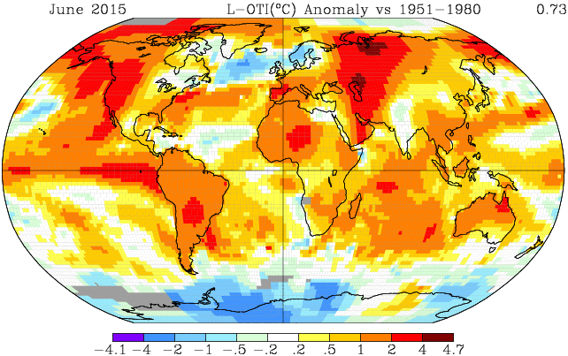
First the good news. James Hansen, one of the world’s most recognized climate scientists, along with 13 of his well-decorated fellows believe that there’s a way out of this hothouse mess we’re brewing for ourselves. It’s a point that’s often missed in media reports on their most recent paper — Ice Melt, Sea Level Rise, and Superstorms. A paper that focuses on just two of the very serious troubles we’ll be visiting on ourselves in short order if we don’t heed their advice.

The way out? Reduce global carbon emissions by 6% each year and manage the biosphere such that it draws carbon down to 350 ppm levels or below through the early 22nd Century. To Hansen and colleagues this involves a scaling carbon fee and dividend or a similarly ramping carbon tax to rapidly dis-incentivize carbon use on a global scale. Do that and we might be relatively safe. Safe, at least in the sense of not setting off a catastrophe never before seen on the face of the Earth. That’s pretty good news. Pretty good news when we consider that some of the best climate scientists in the world see an exit window to a hothouse nightmare we’re already starting to visit upon ourselves.

The bad news? According to Hansen and colleagues, even if we just continue to burn fossil fuels and dump carbon into the atmosphere at a ‘moderate’ pace some of the terrifically catastrophic impacts of human caused climate change are not too far off.

A Moderate Pace of Burning

The new Hansen paper takes a look into both our geological past and our climate future in an attempt to give us an idea what may be in store. In this scenario, model, and paleoclimate based study, Hansen and colleagues assume two things about global human civilization. The first assumption is that we don’t follow the worst case, business as usual carbon emissions policies that lead to around 1000 ppm CO2 in the atmosphere by 2100. It is instead assumed that some effort is given to reducing coal, oil, and gas consumption. That some renewable energy, increased efficiency and behavior changes replace a significant portion of future fossil fuel emissions. But the most effective solution — a complete transition away from fossil fuel burning over the next few decades — fails.

A1B1

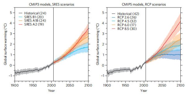
(A1B is a ‘moderate’ emissions scenario that, according to model essays, is likely to see between 2.5 and 3.5 C warming by the end of this Century and around 700 ppm of CO2 accumulation. That is, without the kind of major ice sheet response indicated in the new Hansen study. Image source: Knutti and Sedlacek.)

As a result, we end up with around 700 parts per million carbon dioxide in the atmosphere by 2100. In such a case we’ve followed what the IPCC community terms as the A1B or ‘moderate’ fossil fuel emissions scenario.

A Question of Melt Rate Doubling Time

It is in this context that the Hansen paper attempts to determine a key factor that will have wide-ranging impacts on ocean health, the continued existence and lifespan of coastal cities, and on the severity of the weather itself. That factor is captured by a single simple question — if we continue a moderate pace of fossil fuel burning, then how rapidly will ice sheet and ice shelf melt double?

To Hansen this is a critical question. One he has already done quite a bit of work to answer over recent years. And according to his findings it looks as if land ice melt rates for both Greenland and West Antarctica could now be doubling every 5-20 years. It’s a doubling rate that may find a historical allegory in the milder yet still intense glacial outflows of times long past. And it’s something that, according to Hansen, is being directly driven by an extreme pace of human-based greenhouse gas accumulation.

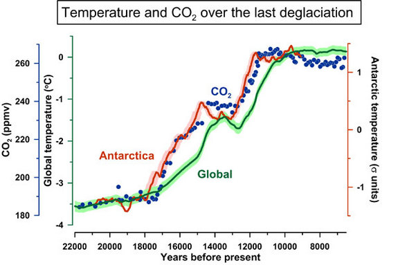
The Eemian — Significant Sea Level Rise and Terrible Storms Under Far Lower CO2 Forcing

To this point, Hansen’s new paper takes a dive into the paleoclimate study of an ice age interglacial that bears some stunning similarities to our own, human warmed, time period. He looks at the Eemian, a warm period that occurred 130,000 to 115,000 years ago. A period that featured temperatures in the range of 1-2 C above 1880s values (we’re in the process of hitting 1 C above 1880s values this year). A period in which CO2 levels were in the range of 285 parts per million (about 15 parts per million higher than the Holocene average before humans spiked that level to 400 parts per million during recent years). And a period that, according to Hansen’s broad study of past research, included numerous Heinrich type glacial outburst and melt events.

Back then, at 285 parts per million CO2 levels, seas were as much as 5-9 meters (16 to 30 feet) higher than they are today. The global climate, on the other hand, was much stormier. For two Heinrich type events that Hansen investigated were found to have dramatic impacts on severe storms in the North Atlantic during the Eemian. Hansen found large boulders propelled up onto the islands of Bermuda and the Bahamas by what appear to be powerful storm waves. Hansen also noted chevron shaped wave channels carved into the calcified sand beds in the Bahama Island Chain.

Heinrich Event

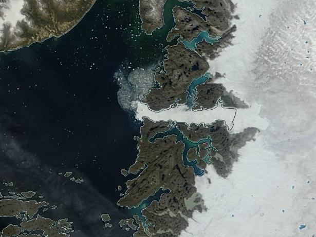
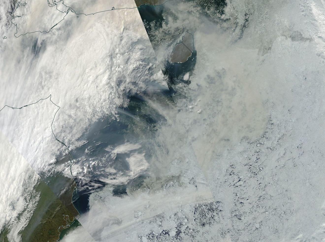
(Heinrich events included major glacial outflows like the one seen here at Jacobshavn, Greenland. Note the significant ice volume outflow through the channel at center frame. Also note the white dots in Baffin Bay indicating ice berg discharge. For reference, bottom edge of frame is about 100 miles. In past Heinrich Events outflows like the one seen above hit high gear as glaciers released armadas of ice bergs into the oceans which generated ocean and atmospheric changes. As the ice bergs melted, they deposited rocks on the sea bed. These piles of ice raft debris then became a signature geological feature of Heinrich events in the ancient past. Image source: LANCE MODIS.)

It paints an overall picture of very stormy weather in the North Atlantic as a result of these Heinrich ice sheet melt episodes affecting Greenland and West Antarctica. These melt events drove fresh water out into the North Atlantic and the Southern Ocean at the rate of about 0.5 to 1 meters of sea level rise per century. The expanding cold, fresh water along the surface zones in the upper latitude waters shut off heat exchange between the ocean and the atmosphere by generating a stratified ocean state. This fresh water wedge interrupted the plunging of heavier, salt-laden waters in the North Atlantic and the Southern Ocean. A loss of heat exchange that resulted in the cooling of airs directly over the fresh water outflow pools.

Meanwhile, since heavy, saltier waters were no long diving to the ocean bottom in these regions — broader ocean circulation was interrupted. As a result, heat from the equator was no longer traveling poleward. The equator warmed. The cold, fresh water outflow regions cooled. And this high temperature gradient subsequently became a powerful storm generator — providing extreme baroclinic potential energies for the storms that likely reshaped the ocean bottom and deposited massive boulders upon islands throughout the North Atlantic.

It’s worth noting that the 5-9 meter sea level rise during the Eemian occurred in the context of global temperatures that are now similar to our own (1-2 C above 1880s values). But it’s also worth considering that the underlying CO2 and greenhouse gas conditions for the current age are far, far worse. Peak global CO2 during the Eemian never hit higher that 285 parts per million. For the Anthropocene age we are now leaving the 400 parts per million CO2 level in the dust. Meanwhile, the pace at which we are warming is also more than 10 times faster than the pace of warming to peak Eemian heat values. And it’s these two factors — an extreme greenhouse gas overburden combined with a very rapid pace of warming that has Hansen and colleagues very concerned about our climate situation over the next 10-80 years.

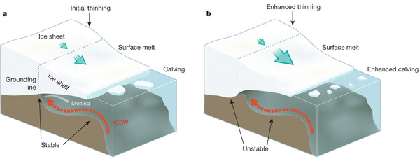
Land Ice Below Sea Level — Amplifying Feedback For Melt

Turning to the current day, there’s a growing number of reasons why we should be concerned that rapid land ice melt, large fresh water outflow to oceans, and resulting superstorms could be in our future. First, we’ve learned that the topography of Greenland and Antarctica include numerous channels that tunnel deep into its great glaciers at depths well below sea level. When oceans warm, and they’re warming as you read this, the submerged, sea-facing slopes of glaciers are confronted with more and more heat gnawing away at their under-bellies. Just a 0.1 C increase in water temperature can melt away a meter of ice over the course of a year. Multiply that by glaciers with faces that are submerged hundreds of feet deep whose sea fronting cliffs extend for many miles and you can end up with quite a lot of melt due to very little warming. As more of the undersides of glaciers melt, more of the water tunnels inland and large masses of ice are rafted away from the central ice exposing still more of the land anchored ice to a warming ocean flood.

image

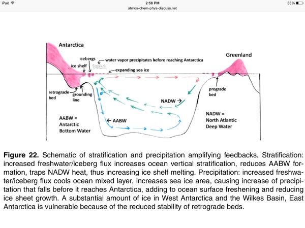
(Image from Hansen Paper shows how land ice melt generates ocean stratification which is an amplifying feedback that enables ocean bottom warming and more land ice melt. Note — AABW stands for Antarctic bottom water, NADW — North Atlantic down welling. Image source: Ice Melt, Sea Level Rise, and Superstorms)

As bad as this dynamic may sound, the process includes one more wrinkle that makes it even worse. As the undersides of ice shelves erode and more fresh water laden ice bergs are pulled out into the ocean, these ice bergs begin to melt en mass. This massive ice melt develops into an enormous and expanding pool of fresh water at the surface. And its this troublesome demon that traps heat in the deeper ocean levels. So, in other words, as the ice from the land glaciers floats away and melts it traps and focuses more heat at the base of these great glaciers. It’s an amplifying feedback. A very serious kind that doesn’t even require the human forced kick to create severe trouble. One that during the Eemian really wrecked the weather and caused massive surges in ocean height.

It’s a process that Hansen and his colleagues believe make both Greenland and West Antarctica very vulnerable. A process that could, when combined with the high velocity human heat forcing, produce melt rates that double every 20, 10 or even every 5 years. But of the two — Greenland or Antarctica — which is worst off?

Greenland topography

(Topographic map of Greenland sans its great ice sheet. Most of central Greenland’s mass is now below sea level. It’s a basin that now holds a miles high ice mountain. Various channels allow ocean water access to the central ice mass should the channel openings melt due to warming oceans. Such an invasion could set off a rapid sea level rise driven by Greenland melt. Image source: Livescience.)

Greenland, for its part, is little more than a great Archipelago held together by its stunning ice mass. Remove the ice and the interior of Greenland would flood, leaving a ring of islands as a final remnant. Though deep, most of these channels run up slope. And this feature, according to the Hansen study, may be one saving grace for potential Greenland ice melt pace. Up slope channels limit the impact of basal melt by serving to check rates of catastrophic destabilization. So though Greenland is certainly vulnerable to ice melt due to the fact that many channels cut hundreds of feet below sea level and into the island’s glacial heart, it is not as vulnerable as West Antarctica.

There, many channels cut deeper beneath the Antarctic ice mass. But not only are they below sea level by hundreds of feet as with Greenland, they slope down. They slope down and not for just a little ways under the ice sheet — some of these ocean heat skids extend in down-sloping fashion for hundreds of miles beneath the Antarctic ice. The result is a kind of skid, that once unlocked by initial melt, can continue to expose larger and large chunks of bottom ice to the warming ocean. Allowing, ultimately, the creation of new warming seas underneath the ice and floating it away in very rapid fashion.

In West Antarctica, ice shelves facing the Weddell and Ross seas both feature these dangerous retrograde slopes. In East Antarctica, the Totten Glacier is likewise vulnerable as are many other glaciers surrounding the vast periphery of Antarctica.

Retrograde slope Ross ice shelf

(Retrograde slopes behind ice sheet grounding lines are just one reason why Antarctic land ice is so unstable. Image source: Ice Sheet Mass Balance and Climate Change.)

Finally, in addition to being surrounded by the warming, deeper waters of the Southern Ocean, in addition to featuring dangerous retrograde slopes that channel warming sea water further and further inland and beneath the ice sheets, West Antarctica itself sits on a geological hot bed. Though not mentioned in the Hansen study, recent work also highlighted that West Antarctica rests atop a geologically active zone that had formed numerous sub-glacial lakes warmed by geological activity. This added geological heat makes West Antarctica that much less stable — an instability that when given the shove of human heated oceans is leading the Larsen B Ice Shelf to completely collapse by 2020. It makes Antarctic land ice that much more vulnerable to the added heat human beings are forcing into the oceans and opens up the ominous possibility that melt rate doubling times for West Antarctica could become quite extreme indeed.

Modeling Land Ice Melt’s Impact in the 21st Century — Facing A Coming Age of Superstorms

So what does all this mean? In the worst case (5-10 year melt rate doubling times), it’s possibly 3 meters of sea level rise by mid Century, perhaps 7 meters by end Century under business as usual fossil fuel emissions. Even in the more moderate cases (10-20 year melt rate doubling times), 1 meter of sea level rise by mid Century and 3 meters or more of sea level rise by end Century is not entirely out of the question, according to Hansen’s new research. These potentials are markedly different than the more conservative rates outlined by IPCC which is still calling for a less than 1 meter sea level rise under even the worst case human carbon emissions scenarios (1000 parts per million CO2, in the range of 1200 ppm CO2e).

So much fresh water hitting the oceans would cause a rapid stratification. A rapid loss of ocean to atmosphere heat exchange in the regions impacted. A train wreck of heat backing up at the equator. Such a train wreck would result in temperature extremes and gradient differences that would make the Eemian Heinrich events (mentioned above) seem moderate and slow by comparison.

Hansen has been working on global atmospheric models for tracking these events for a number of years now. And this new study is an improvement on his earlier, model-driven “Storms of My Grandchildren” work. Hansen’s new model runs are imperfect simulations of what may happen given large melt pulses from Greenland and Antarctica. The models, according to Hansen, mix the ocean water too much, reducing the overall impacts of stratification through the mechanism of the fresh water wedge. However, even with this imperfection, the temperature gradients displayed by these models are absolutely stunning. A clear warning to anyone who still wants to keep burning fossil fuels that they’re really grabbing the dragon by the tail.

image

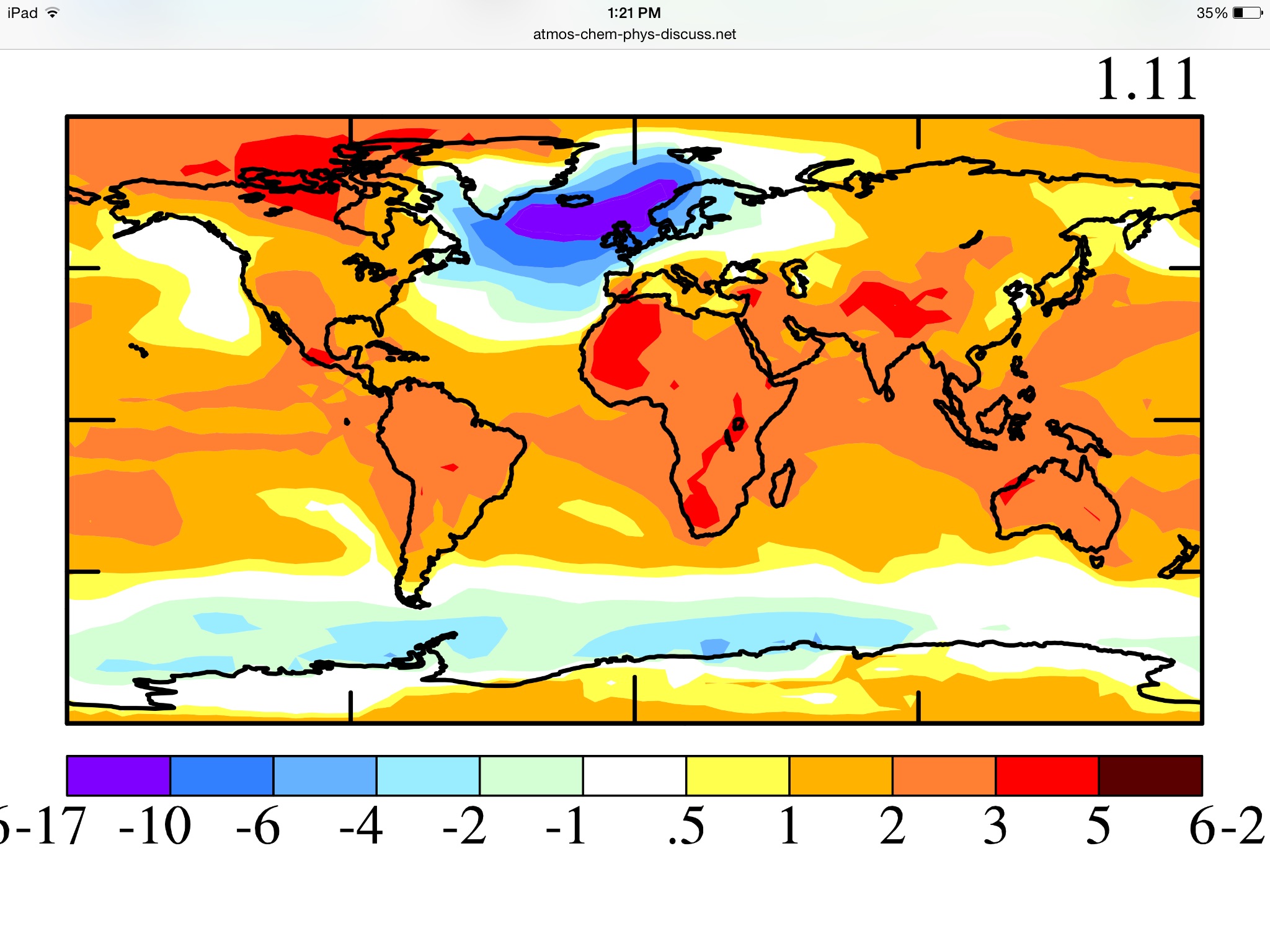
(A mid range simulation including 10-20 year melt rate doubling times and 6 feet of sea level rise by 2080 — half Greenland, half Antarctica — shows enormous weather impacts in the form of a severe, superstorm generating, temperature gradient. Image source: Ice Melt, Sea Level Rise, Superstorms.)

In the above image we can see just one of these model runs. The model assumes a 10-20 year doubling time for rate of land ice melt. It contributes equal portions of melt from Greenland in the north and Antarctica in the south. Greenhouse gas accumulation is considered to be along the moderate case A1B track. By 2080 we have about six feet of sea level rise globally and about 600 parts per million CO2 in the atmosphere. The more rapid rate of melt has put a temporary damper on the rate of global atmospheric warming which has dipped to 1.11 C above 1880s values (just slightly higher than today). But much of this cooling is localized to the Southern Ocean and to an extreme cold pool in the North Atlantic between Northwestern Europe and Greenland.

There a massive outflow of fresh water has shut down the ocean’s ability to exchange heat with the atmosphere. AMOC has been vastly weakened. The Gulf Stream is backed up along the US East Coast and into the Gulf of Mexico. Heat is building in the Arctic opposite Greenland and all along the Equator. Temperature anomalies in the range of 17 degrees Celsius below average occur over the ocean fresh water pool. This drop is enough to generate year round winter like conditions in the cold pool region even as other sections of the atmosphere around it continue to warm or retain severe excess heat.

Energy imbalance at the top of the atmosphere rockets to between 2 and 4 Watts per meter squared. What this means is that, in failing to ventilate heat to the atmosphere in the North Atlantic and Southern Ocean, the world ocean system has continued to accumulate a massive amount of heat. Heat that is now going to work warming the ocean bottom and hitting the bases of the already rapidly melting land ice.

Sandy

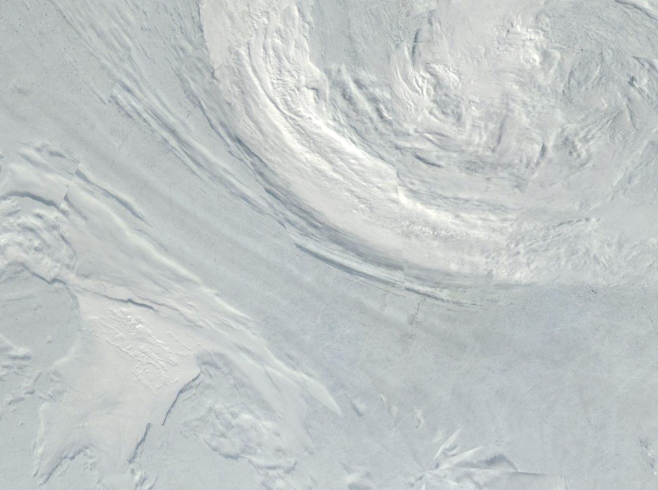
(More superstorms in our future. If Hansen’s new research is correct storms like Sandy will grow both more powerful and more common as Greenland dumps ever increasing volumes of fresh water into the North Atlantic. Image Source: NASA.)

For the North Atlantic, it is the greatest of understatements to say that an area of perpetual winter surrounded by warming airs and sitting atop a warming deep ocean is a major storm generator. Summer time temperature deltas between the center of the cold pool will range from near zero C to 20s, 30s and 40s C over nearby ocean and continental land masses. It’s like taking the High Arctic and shifting it to Scotland while all the adjacent airs warm. Temperature gradient and baroclinic (pressure gradient) energy for storm generation will be on the order of something that modern humans have never experienced. The potential for superstorms in this model simulation will, notably be quite high.

Final Notes — Superstorm Conditions Could Emerge Sooner than Models Indicate

The point to consider here is that large scale land ice melt sets in place forces that result in a weather wip-lash of epic proportion. It’s been the heart of Hansen’s work for many decades and it’s an issue that we really need to consider as time goes forward. A dwindling time for response that may well be much shorter than even Hansen’s models indicate. First, ice sheet vulnerability may well be higher than IPCC officials imagine and we could well be on a slope of melt rate doublings in the range of 5-20 years now.

global sea level change

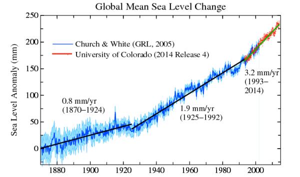
(Global sea level rise keeps hitting a steeper and steeper slope. Image source: Dr. James Hansen, Columbia University)

Second, Hansen’s models likely capture the atmospheric impact of such large-scale land ice melt later than would happen in the real world. This later capture is due to the fact that his low resolution models mix the ocean heat more with the atmosphere than would occur under the kinds of ocean stratification events that we are likely to see due to these doubling times. Third, and finally we return again to the paleoclimate time of the Eemian where there is ample evidence that a mere 0.5 to 1 meter per century rate of sea level rise due to melting Greenland and West Antarctic ice during that time set in place conditions to generate superstorms with high enough peak intensity to deposit massive boulders upon islands in the Atlantic and to carve the impression of gigantic, long-period waves into the sea bed.

Anyone reading this work and considering the notion that some of the greatest scientific minds this age has birthed could be right is immediately confronted with the realization that the gargantuan forces we are playing with are not to be trifled with. And yet, the trifling continues despite the wise and well considered scientific warning to relent.

Links:

Hansen Paper: Ice Melt, Sea Level Rise and Superstorms

Dr. James Hansen, Columbia University, Former NASA GISS Lead Scientist

Knutti and Sedlacek: Robustness and Uncertainties in Climate Model Projections

The Eemian

LANCE MODIS

Livescience — Topographic Map of Greenland Sans Ice Sheet

Ice Sheet Mass Balance and Climate Change

NASA: 10,000 Year Old Ice Shelf to Collapse by 2020

IPCC Sea Level Change

NASA Earth Data

Storms of My Grandchildren


Glacier National Park is Burning

A bad wildfire year for the US and Canada just got that much worse. As of yesterday a fire had ignited in Montana’s majestic Glacier National Park. As of today, the fire had consumed nearly 3,000 acres and it’s still growing. In other words — Glacier National Park, a national monument, a natural wonder, a place known for its towering glacier-capped peaks and frozen valleys, is now on fire.

Glacier National Park Burning

(A massive wildfire is now burning in Glacier National Park. Image source: Commons.)

Strong winds and low humidity combine to generate what fire management officials call — ‘explosive fire growth potential.’ These conditions allowed the fire to burn over 1,000 acres during just a few hours yesterday and to rapidly expand to cover nearly 3,000 acres today. The fire there has now spurred officials to order a complete evacuation of St. Mary’s Park and to suspend all activities until further notice. A 50 mile long road running through the park has also had 21 miles blocked off to traffic. Type 1 incident management teams are now en route to the blaze which is still growing.

The fire occurs as other blazes are now popping up throughout both Montana and Washington. East of Glacier National Park, the Cabin Gulf Fire also exploded to 1,000 acre size yesterday — drawing the firefighting efforts of 10 aircraft and dozens of hot shotters. In southeastern Washington, more than 600 firefighters battled a single blaze that had consumed more than six square miles including one residence. Across Washington other forest areas, including rain forests, were also experiencing a widespread fire outbreak.

Glacier National Park Smoke plume

(Plume from Glacier National Park Fire spreads over hundreds of miles in yesterday’s satellite shot. Image source: National Weather Service Great Falls.)

The glaciers of Glacier National Park have greatly retreated during recent years. Many once snow-capped peaks now show only the gray-brown of naked granite. This multi-decadal melt, driven by a 1 C warming of the global climate since the 1880s, has also set the stage for more fire vulnerability. A vulnerability that, this year, hit a new high extreme as powerful heatwaves invaded Montana as well as much of the Canadian and American west. Many regions are now experiencing record wildfires for June and July. Now Glacier National Park can be added to that grim tally.

Links:

Montana Wildfires

Fire in Glacier National Park

Glacier National Park Wildfire Tops 2,000 Acres

Fire at National Park Forces Evacuations

National Weather Service Great Falls

Commons

Climate Refugees — Extreme Weather Displaced 157.8 Million People From 2008 to 2014

Does it seem to you that the weather is getting worse? Rainfall more intense, droughts drier, longer, more prolific, the strongest storms growing ever stronger? Well, in this case, seeming is all-too-real.

Four decades ago our climate was more placid. Global temperatures were about 0.5 C cooler than they are today. There was less available heat energy to pump up storms. The intensity of evaporation and precipitation was about 4 percent less than it is today and the pace of global warming due to an ongoing fossil fuel emission was slower. Our atmosphere has changed. It has become more dangerous. More capable of producing extreme and disrupting weather events.

Scale of displacement

Nearly 158 million people, or a number equivalent to just under half the population of the United States, were forced from their homes as a result of extreme weather over the past 7 years. It’s a number six times greater than those displaced by earthquakes, volcanoes or other geophysical causes. Individuals living on the Earth today are now at a 60 percent greater risk of being displaced — chiefly due to increases in extreme weather — than they were in 1975. Image source: Internal Displacement Monitoring Center.

And it’s for these reasons that you and I are more vulnerable. More likely to become a casualty of worsening weather. For according to the Internal Displacement Monitoring Agency, an agency that tracks the number of displaced persons globally, you and I are 60 percent more likely now to be forced from our homes by a natural disaster than we were in 1975.

The numbers at this point are pretty concerning. On average, over the past 7 years, 26 million people have been displaced by natural disasters in a single year during that period. For 2014, the count was 19.3 million, 17.5 million of which came from extreme weather events — a factor directly related to human-caused climate change. In total, weather disasters resulted in 157.8 million people being forced to flee their homes during the entire period from 2008 to 2014. Extreme weather — not warfare, volcanoes, or tsunami — is now the primary reason human beings are displaced. Droughts, wildfires, floods, powerful hurricanes, superstorms. A litany of self inflicted violence whose impacts we are continuing to worsen.

Displacement by hazard type

From 2008 to 2014, storms and floods resulted in 84% of natural disaster caused displacements. In 2014, storms and floods generated 91% of the total displacement. Image source: Internal Displacement Monitoring Center.

The Impacts of Displacement Linger as Worsening Weather, Sea Level Rise Loom

Displacement caused by natural disasters is not an easy problem to fix. Anyone who suffered the loss of a home due to impacts related to Superstorm Sandy or Hurricane Katrina can attest to the fact that it often takes a long, long time to become re-established under a secure shelter. For this reason millions of people displaced by extreme weather disasters over the last few years have continued to live as a kind of climate refugee — forced to reside in tent villages or other temporary shelters. Reliant on government assistance because much of what they had, the storms destroyed. Often segregated from larger populations these groups suffer greater risk of falling into permanent poverty and contracting disease even as they are even more vulnerable to subsequent displacement from follow-on events.

As global warming intensifies and the risk of extreme weather events continues to increase, there is also an increasing risk that this expanding number of displaced persons will result in nation-destabilizing stresses in various regions of the world. Currently, the greatest number of displaced persons is centered in the high population density countries of Asia and the Caribbean. But as climate change begins to add another flood stress due to global sea level rise, it is likely that displacement will become ever more ubiquitous.

Even more concerning is the fact that the storms we see now are the early, easy outliers. The ‘small’ climate change weather demons that have already displaced more than 150 million people. Hansen’s Storms of our Grandchildren haven’t yet arrived in full force. And rates of sea level rise are just now starting to ramp up. Would that we had the wit, will, and wisdom to help prevent at least some of this unfolding tragedy. If we do not, there’s no fall back. We’re it.

Links:

Internal Displacement Monitoring Center

NOAA Temperature Graph

How Global Warming Wrecks the Jet Stream and Pumps up The Hydrological Cycle to Generate Extreme Weather

The Storms of My Grandchildren


NOAA Shows June of 2015 Smashed All Prior Heat Records; El Nino Keeps Strengthening; Hothouse Mass Casualties Strike Europe, Japan

Under an oppressive human fossil fuel emission, the world just keeps getting hotter and hotter, the 2015-2016 El Nino just keeps looking ever more monstrous, and reports of tragic, heat-related, mass casualty events just keep rolling in.

*   *   *   *

JULY 21, 2015: All the major climate monitors have now chimed in — NASA, Japan’s Meteorological Agency, NOAA. And June of 2015 is now marked as the hottest recorded in every single one. But of these, the NOAA measure, which provided its Global Analysis report yesterday, clearly is the starkest.

Showing extraordinary warming, June of 2015, according to NOAA, hit +0.88 C above the 20th Century average. That’s an excessive leap of +0.12 C over last year’s previous record June measure showing a +0.76 C global temperature departure and just 0.02 C behind the all-time monthly record values for any month hit just this year during February and March (+0.90 C).  When compared to 1880s averages, June was fully 1.08 C hotter. That’s more than halfway to the (not safe) 2 C threshold which IPCC has marked off as the point where catastrophic impacts from human caused climate change really start to hit high gear.

June anomaly

(On the up ramp to a hothouse. The NOAA global climate record for land and ocean temperatures over the last 136 years in which June of 2015 is now the all-time hottest. Image source: NOAA.)

We can clearly see the progress of rapid warming over the past 136 years in the above graph. Particularly since 1980 — when global temperatures really started to hit a rapid ramp up. Note that the mythological pause is not at all evident in the above graph. Global temperatures through June measures just kept driving on — higher and higher.

Back to Back Record Years on the Way — The Human Warming Escalator and The El Nino Jump

With all the June measures coming in so strongly on the hot side, and with the first half of this year already substantially warmer than the previous record warm year of 2014, it appears that we are locking in for back-to-back years of record heat. These new records are occurring in the context both of the larger, human-forced warming trend and as we hit the warm end of the global natural variability scale — El Nino.

It’s important to remember that the driver of these new records is the underlying accumulation of greenhouse gasses in the atmosphere. Deke Arndt, chief of the monitoring branch of NOAA’s National Centers for Environmental Information (NCEI), noted at a press conference last month:

“Climate change is a long-term driver, so that’s like standing on an escalator as it goes up. So, the longer that we go into history, we’re riding up the escalator. And now that we’re getting an El Niño event, we happen to be jumping up at the same time, and so they play together to produce outcomes like what is likely to be the warmest year on record.”

And propelled by that human warming escalator, the current El Nino jump is starting to look absolutely savage.

El Nino Just Keeps Growing Stronger

For today’s Australia Bureau of Meteorology (BoM) report showed the current El Nino striking down yet another 1997 record. According to BoM findings, all key Nino ocean zones have shown surface temperatures in excess of 1 C above average for 10 successive weeks. This shatters the previous record duration for such an event — occurring in 1997 at 8 weeks in length. Notably, the current record heat build for Nino zones is still ongoing. So the new, 2015 record could extend further.

Overall, BoM shows the entire Eastern Equatorial Pacific now at +2 C. To get an idea what this looks like, we can take a peek at the Earth Nullschool sea surface temperature anomaly measure:

image


(The entire Northern, Eastern and Equatorial Pacific is exceedingly hot — showing anomalies in the +1 to +4 C range practically everywhere. Meanwhile, temperatures in the Central Pacific are starting to approach Super El Nino ranges. Image source: Earth Nullschool.)

Taking in this shot, it’s worth pausing for a moment to appreciate the fact that not only is the Equatorial Pacific outrageously hot, the entire Northern and Eastern Pacific from the Arctic on south is just off-the-charts hot. If you ever wondered what the emerging face of a Godzilla El Nino looks like, well, just remember this shot.

NOAA, meanwhile, shows El Nino continuing to extend its foray into strong event range. The critical Nino 3.4 measure of Central Pacific Ocean temperatures jumped again in the July 20 weekly report — hitting a +1.7 C anomaly. This is jump up from last week’s +1.5 C measure and is now knocking on the door to a super El Nino threshold of +1.8 C. NOAA’s three weekly reports for July now average +1.53 C for the Central Pacific — solidly in strong El Nino range for the month.

NOAA also began to track a third warm Kelvin Wave running across the Pacific. This Kelvin Wave is propagating eastward as a result of a strong West Wind Backburst that has blown over the Western Pacific throughout much of July. These winds are pushing warm surface waters down and under the Equatorial region. Ocean heat that will resurface off South American. Recharging already hot waters with a new hot influx and further strengthening an already strong El Nino.

The signal of this new warm water flood is now really starting to show up in the model runs. Corrected seasonal models now show an event in the range of 1997-1998. Uncorrected runs, including the Euro ensemble, continue to show potentials for an event that would make the 1997 Super El Nino look tiny by comparison.

Monthly anomalies Nino 3.4 Monster El Nino

(NOAA’s CFSv2 models still picking up a heat impact murmur of a monster El Nino in our near future. Image source: NOAA.)

Typically, El Nino reaches peak strength during Northern Hemisphere Fall and Winter. So we’re in a ramp-up phase that could last through October and November and we are already starting to hit strong event values in July. The current El Nino is predicted to remain a feature until late Winter or early Spring of 2016. Strongest global temperature heightening impacts come during and slightly after peak ocean warming due to El Nino. So the temperature records we’ve seen so far in 2014 and 2015 may just be prelude to the main event.

Heat Related Mass Casualties in Europe and Japan

It really is the kind of global heat spike that you don’t want to see. The kind that enables heatwaves to put droves of people into hospitals with life-threatening heat ailments. Earlier this summer, both India and Pakistan suffered mass casualty heatwave events. Instances that filled hospitals with tens of thousands of patients. In India, 2,500 souls were lost. In Pakistan, the number hit 1,242. These represent the 5th and 8th most deadly heatwaves on record, respectively.

Now, reports are starting to trickle in that Europe and Japan are suffering similar, although still somewhat less acute mass casualty events due to record heat. According to Dr. Jeff Masters, excess mortality due to heat had claimed more than 1,200 lives across Western Europe through early July. Meanwhile, reports are also starting to trickle in from Japan of heat related mass casualties. A report last week from Japan’s Fire and Disaster Management Agency found that 3,000 people had been admitted for heat stroke to hospitals across the island nation during the period of July 6 through 12.

Over the next few days, record-breaking heat is again expected to invade parts of southern Europe, setting the stage for more potential heat casualties.

Conditions in Context — Heat Breaking New Records Means More Extreme Weather

All time record high global temperatures for 2015 and likely at least a decent period during 2016 means we are also likely to continue to experience odd and severe weather conditions over many regions of the globe. A fact that was punctuated in Southern California earlier this week as the remnants of a tropical cyclone dumped 1.69 inches of rain — or more than ten times the amount of rainfall typical for July — over parts of San Diego through Monday. Possibly a taste of what’s to come for California should the currently building Godzilla-type El Nino — pumped up by a catastrophic rate of human greenhouse gas emission — crush the West Coast blocking pattern and hurl a barrage of powerful storms at the drought-parched state. A situation many may be hoping for at this time, but which they could easily come to regret as the extreme intensity of weather switches in the new climate age of 1 C warming start to become evident.

Links:

NOAA Global Analysis

June 2015: Earth’s Warmest on Record

2015 On Track to Be Hottest Year Yet

NOAA Press Conference Notes

Earth Nullschool

What The Weekend Rains Did to Southern California

Hat Tip to Colorado Bob and Ryan in New England

Hat Tip to Andy in San Diego (How about that rain?)

Hat Tip to Matt


June Snow Melt Brings July Arctic Sea Ice Drop-off

It’s a pretty well established theory. If snow over the Northern Hemisphere land and sea ice masses substantially melts during May and June, it can tend to set up a general weather pattern that is conducive to large-scale reductions of the Arctic sea ice come July, August and September.

Arctic Sea Ice in ragged condition during mid July

(Arctic sea ice in very ragged condition by July 19, 2015. A situation born of a continuous Greenland and Central Arctic high pressure ridge setting up warm air build-ups and a sea ice-flushing dipole weather pattern. Image source: LANCE-MODIS.)

Arctic High Pressure, Heat, Collapsing the Sea Ice

And, during June, we saw just this kind of trend emerge. Arctic heatwaves over both the Continental land masses and the Arctic sea ice resulted in a rapid melting of snow cover. Heatwaves fed by massive bulges in the Northern Hemisphere Jet Stream, particularly along the now-famous Ridiculously Resilient Ridge over what is today an amazing (horrific) hot zone of Northeastern Pacific surface waters. El Nino and Positive PDO played their role too, kicking up the hot zones and the ridge to ever greater intensity. An atmospheric and ocean synergy in a 1 C hotter than 1880s context that kept hurling more and more heat into the Arctic environs. Melting more snow and setting the stage for a potential sea ice massacre to come.

By early July there were indications that just such an event may be on the way. A ‘heat dome’ type high pressure system had become well established over the Greenland side of the High Arctic. And for the past three weeks now, this high has remained entrenched. A persistent weather pattern that has allowed more sunlight to hit the sea ice during periods of peak insolation, a pattern that compacts sea ice in the Central Arctic, a pattern that draws storms into the Siberian side of the Arctic to chew away at the ice edge, and a pattern, that overall, drives the ice inexorably toward its Atlantic Ocean flush valve in the Fram Strait.

Arctic Heat

(Hot to record hot conditions have remained in place over the Arctic Ocean throughout July. Image source: NSIDC)

All this extra heat, transport, compaction and storms chewing away at the sea ice edge has finally started to take a very serious toll. As of today, sea ice extent measures had dropped from 7th to 10th lowest on record to 6th to 7th lowest. Area has remained at 4th to 5th lowest on record for the date. Meanwhile volume in the DMI measure has dropped to 2nd lowest on record.

Most charts now are starting to show a steep ‘cliff’ type rate of decline indicative of rapid sea ice collapse. This is particularly true in NSIDC’s Charctic and Cryosphere Today’s sea ice graphs which now show both extent and area lines plunging at rates that will rapidly cross new thresholds if they continue over the coming days.

Sea Ice Concentration in a Rough State

But perhaps most disturbing of all are the indicators that are now showing up in nearly all of the visual concentration monitors. Uni Bremen sea ice concentration continues to look like a massacre on the Pacific side. NSIDC doesn’t appear to be much better. But Cryosphere Today takes the cake for an overall display of sea ice weakness that, on the 19th (updated as the CT measure used earlier ended up being a bit off), looked nearly as bad as on the same day during the record melt year of 2012:

2012 to 2015 Comparison

(Comparison of July 19, 2015 and July 19, 2012 shows 2015 looking nearly as bad as 2012 in the concentration measure. Image source: Cryosphere Today.)

Comparing the left frame image with the MODIS satellite shot at the top of this post, we find confirmation of an overall, very weak sea ice state. Concentration throughout the Arctic appears low. This is especially true on the Beaufort, Chukchi and East Siberian Sea side (see MODIS shot at bottom of post). But extensive weakness and low concentration appears to pervade the entire ice mass. Zooming in on the sea ice surface, we find that some of this low concentration is possible to confirm. The entire Arctic is now full of broken floes, polynya and melt ponds.

Though it is also possible that this extensive melt ponding (also a feature that weakens sea ice) may have kicked the Crysosphere Today concentration sensor a bit into the extreme scale (corrected during the past 24 hours), the 2012-to-2015 comparison above is still apples to apples. And what’s a bit disturbing about this comparison is the fact that much of the concentration in red (55 to 70 percent) in the 2012 measure completely melted out at the ocean surface by mid September of that year. More notably, perhaps, is the fact that the Cryosphere Today concentration measure is, at least in part, confirmed by the US Navy ARCc Concentration model which has now begun to pick up some of the earlier predicted rapid melt in the observational ensemble:

US Navy Concentration

US Navy Concentration Forecast

(Sea ice massacre starting to show up in the US Navy ARCc model daily observations [top frame] and continues to be predicted in the 30 day history and 7 day forecast [bottom frame]. Image source: US Navy.)

Above, we see very low sea ice concentration practically anywhere outside the 80 degree North Latitude line. Most notably, concentration is very thin and rapidly weakening in the Beaufort, Chukchi, East Siberian, and Laptev Seas. And the seven day forecast shows very rapid melt throughout all these regions with the low concentration bulge beginning to invade north of the 80 degree line on the Laptev and ESS side in particularly troubling fashion.

Forecast — Continued Rapid Melt, Some Records May be Threatened

So the question, going forward, is — what next? And it appears that the sea ice is being prepped for continued rapid to accelerating melt over at least the next 7-10 days. Seven day forecasts show the ridge remaining on the Greenland side of the Arctic throughout the period. A position that will continue the current melt, transport and ice weakening regime. Longer range, ten day, ECMWF forecasts find the high shifting more toward a strong ‘heat dome’ located in the Central Arctic with a somewhat weaker high remaining over Greenland — a minor variation of the current ice-weakening state that may slow down ice export but leave compaction, melt ponding, heat build-up, and ice edge weakening due to storms in tact.

Very weak sea ice

(Sea ice throughout the Beaufort, Chukchi, ESS and Laptev is very weak. Can it survive another 10 days of the Greenland/Central Arctic heat dome? Image source: LANCE-MODIS.)

Due to this weather forecast and due to some observations beginning to come in line with ARCc model runs, we cannot rule out a very rapid melt and recession of sea ice along a broad arc running all the way from the Canadian side to East-Central Siberia. The sea ice is visibly very weak there. Perhaps the weakest we’ve ever seen it for this time of year. Ice that will continue to be pulled poleward by the highs that are forecast to remain in place. Ice that will run into weakened, melt pond invaded ice — a paltry respite for its retreat. And ice that will continue to be harried by edge storms and an influx of much hotter than normal air and water from the Pacific Ocean side. It’s a rapid melt risk that calls into effect the potential that some old sea ice area, extent, and volume records may be challenged or broken — probably not 2012’s all time low marks, but more possibly 2011 or 2007.

It’s, overall, a very tenuous situation for sea ice, one that is continuing to be fed by a growing El Nino and still firmly entrenched RRR to the south. So the evolution of sea ice melt over the next few weeks will likely be a critical game-maker for the state of Arctic Sea ice melt and the overall story of Arctic Sea Ice decline in this sad age of human-forced climate change.

UPDATED JULY 21, 2015

Links:

LANCE-MODIS

NSIDC

US Navy

Cryosphere Today

Uni Bremen

June Arctic Heatwave Takes Down Northern Hemisphere Snow Cover

Halfway to 2 C

Arctic Heatwave Pummels Sea Ice in Early July

See Beaufort and Northwest Passage Melt Progress Over at The Arctic Sea Ice Blog

(Please support public, non-special interest based science like the work conducted by the national snow and sea ice monitors, NOAA and NASA. Without their ongoing work, this analysis and commentary would not be possible.)

They Make Water Out of Sludge in Sao Paulo Now

With El Nino settling into a strong-to-monstrous mode and with the world now baking under 1 C of global temperature increases since the 1880s, a large swath from South American through to the Caribbean is suffering from extreme drought.

Drought South America

As we can see in the above map (provided by NOAA) most of South America is experiencing the impact of significant to severe rainfall deficits. Northern Brazil and the Amazon Rainforest are at the epicenter of water losses. But Colombia, Venezuela, Argentina, Chile and Peru all show substantial drying. It’s a drought that stretches all the way up into the Caribbean. One that has set off water rationing over broad regions. Even the US territory of Puerto Rico hasn’t been left unscathed by this wide-ranging drying. There, 160,000 residents and businesses have seen water turned off for 48 hours and then back on for 24 hours. Another 185,000 are losing water services in 24-hour cycles, a further 10,000 are on a 12-hour rationing plan. A hand of drought that had, as of last week, stretched its desiccating fingers all the way to South Florida — setting off wildfires and sending billowing plumes of smoke into Palm Beach skies.

Water From Sludge

But, in all this wide-ranging drought, there are few places where the situation is so acute as it is in Sao Paulo, Brazil. There, the drought is so severe that it has inflicted water rationing on the populace ever since early 2014. A situation that has gone from bad to steadily worse. At the epicenter of these losses is a massive reservoir called the Cantareira. A great lake once filled with enough reserves to supply over 6 million people that has been reduced to what amounts to a giant, drying puddle of mud. A situation that has forced water managers to pump sludge from the Cantareira’s previous dead pool zone and into treatment facilities in order to provide water to Sao Paulo citizens:

Cantareira Reservoir

(“Water like what comes out of the back end of a cow” [hat tip to Andy] being fed from the Cantareira reservoir and into Sao Paulo’s water supplies during February of 2015. Image source: The Telegraph.)

Essentially, in order to provide water, Brazil’s utility managers have been forced to put pump lines in the bottom of the muddy Cantareira reservoir. You can see the heads of these pumps as blue boxes in the above image. The pumps then feed the dead pool water into a spill-way that contacts the old water pump which is now too high in elevation to draw water from the drastically diminished pool.

The Cantareira reservoir is Sao Paulo’s largest, its most essential. At most, it contains about 40 million cubic meters of water remaining before it is bone dry. And it’s losing this water at a rate of 200,000 cubic meters each day. Even worse, it’s uncertain if all the remaining water can be accessed. But if it could, it would take just 200 days to completely bottom out the Cantareira at the current rate of losses. For reference, there are about 100 days left until the rainy season starts in Sao Paulo. But with El Nino strengthening and with the Amazon Rain Forest suffering severe water losses, it is uncertain whether this year’s rainy season will arrive on time.

Looking at the larger water system, the situation is equally stark. Alto Tiete, another Sao Paulo reservoir will reach a dead pool situation similar to the Cantareira in just 90 days at current rates of loss. And the entire water system of Sao Paulo will hit its maximum recoverable water in less than a year if losses are not somehow abated.

With the situation so stark, Sao Paulo water managers have drastically cut back on water outlays to the population. In total only about 54 percent of the typical outlay is reaching the public. The result is a very severe and ongoing situation of water rationing for the metropolis. But even worse would be the near complete loss of Sao Paulo’s water supply. A situation the city and region faces if the rains don’t arrive soon.

*   *   *   *   *

Links:

Water Hoarding Frenzy Set off By Drought, Rationing in Puerto Rico

Palm Beach Wildfires

Sabesp Water Resources PDF

The Telegraph

Hat Tip to Andy in San Diego (Note: Andy provided much of the research for the section on Sao Paulo reservoirs. To this point, Sabesp has become increasingly less transparent as the water situation there has grown more dire and Andy’s dynamite research was necessary to clear up a few of the more murky bits.)

(Please support public, non-special interest based science, like the critical information that was provided for this article by NOAA.)

(Please also support broad-based climate change policy solutions to reduce fossil fuel emissions, increase public access to renewable energy, and to reduce the climate change caused damage that is already locked in.)

Hot Ocean Hurls Nangka’s 1 Meter Rains At Japan; Storm Chases Arctic Heat Delivery Later This Week

This week, a screaming hot Pacific basin hurled six tropical cyclones northward. These cyclones spawned off the back of a building monster El Nino which is predicted to reach strong-to-record intensity by later this year. They also contributed to setting a record for number of cyclones formed in the Northern Hemisphere so early in the year. In the Western Pacific, one of these Cyclones — Typhoon Chan Hom — slammed into Shanghai on July 10th and 11th, delivering high waters, high winds and floods.

Now, another cyclone — Typhoon Nangka — is venting its fury on Japan.

Nangka bears down on Japan

(Nangka takes aim on Japan in this MODIS satellite shot. Image source: LANCE-MODIS.)

A few hours ago, Nangka made landfall near Muroto City. Over the past 24 hours, Nangka had weakened from a category 3 storm packing 115 mile per hour intensity, blustering ashore as a minimal Typhoon with 75 mile per hour maximum sustained winds. Nangka is interacting with a frontal boundary, which interfered with the storm’s circulation even as it injected massive amounts of moisture into Nangka’s encircling thunderstorms. This increased moisture loading — likely also enhanced by global temperatures that are now in the range of 1 C hotter than 1880s averages together with moisture bleeding off an anomalously warm Pacific — is resulting in forecasts for up to 1 meter of rainfall as Nangka continues to churn over Japan.

Nangka’s eyewall and strong south to north winds are running smack into Japan’s ocean facing mountains. The combined high moisture loading and the lifting action of winds running up the mountains are pumping up Nangka’s thunderstorms to extraordinary intensity. Weather radar from earlier today showed hourly rainfall rates peaking at an extreme 3.15 inches per hour near Shikoku. There, after hours of this intense pounding, rainfall totals have hit as high as 23 inches (UPDATE: Kamikitayama village had reported 27 inches of total rainfall as of 5:20 AM local time.)

These heavy rains are expected to continue for the next 24-48 hours with very severe additional totals predicted for a number of regions. Expected new rainfall amounts include:

  • Kinki and Tōkai: 600 millimeters (~24 inches)
  • Shikoku island: 600 millimeters (31 inches)
  • Kantō region: 400 to 500 millimeters (16 to 20 inches)
  • Chūgoku region: 300 to 450 millimeters (12 to 16 inches)
  • Tōhoku region: 250 to 350 millimeters (10 to 14 inches)

Extraordinary additional rains that will bring with them the risk of severe flash flooding and landslides to the mountainous slopes of Japan.

Nangka At Tail End of Warm, Wet Wind Invasion of Arctic Later This Week

As Nangka continues northward, it will become wrapped up in a trough, helping to feed a larger synoptic pattern of moisture and air flow from south to north. The trough, in turn, is projected to rush northward into the Bering Sea. By Monday, a dipole pattern set up between the trough running through the Bering and the Ridiculously Resilient Ridge to the east will pull warm air up from the tropical Pacific and catapult it toward the already weakened ice of the Bering, Chukchi and Beaufort seas.

image

(Long wave north to south synoptic pattern projected to draw warm air and water into the Pacific side of the Arctic over the next 3-6 days. Image source: Earth Nullschool.)

In the above image from Earth Nullschool and based on GFS models, we can see the strong south to north synoptic wind pattern predicted to set up. Flowing from a region near Hawaii, these winds are predicted to pull tropical airs over thousands of miles, run them up through the Bering and into the High Arctic.

In conjunction with this warm air invasion, a head of hot water now at a +5 C positive anomaly in the Chukchi will be driven northward running directly into highly fractured and disassociated ice floes. It’s a weather pattern that is a continuation of consistent warmth hitting the sea ice on the Pacific side of the Arctic. One that is driven both by El Nino and by a human greenhouse gas based amplification of heat in the polar zones. This combination has generated a kind of Achilles heel for Arctic sea ice on the Pacific side for 2015. With another hit coming to this area and with sea ice already in a somewhat tenuous state due to the continued impacts of warm air near Greenland, a Greenland high and a related dipole continuing to nudge the ice toward the Fram Strait, risks rise that current sea ice measures ranging at 4th lowest in area and 7-9th lowest in extent could take a further tumble.

Links:

LANCE-MODIS

Earth Nullschool

Over 20 Inches of Rain as Nangka Makes Landfall

NASA Sees Nangka Knocking on Japan’s Door

Hat tip to Greg

Halfway to 2 C — According to NASA, We Just Blew Past an Ominous Milestone

2 C.

It’s the amount of warming past pre-industrial times that the IPCC says we should try to avoid this Century in order to prevent the worst consequences of human-caused climate change. It’s the so-called safe limit, even though there’s nothing really safe about it and we should probably be aiming more for a below 1.5 C target.

1 C.

It’s the amount of warming between pre-industrial times and, according to the latest data from NASA, the first half of 2015. In other words, temperatures during the first six months of 2015 are now at least halfway toward freeing some of the nastiest climate monsters in the closet.

*   *   *   *   *

According to NASA GISS, June of 2015 was tied with 1998 as the hottest of any June in the entire 135 year global climate record. Coming in at +0.76 C above NASA’s 20th Century average, June follows May at +0.73 C (4th hottest), April at +0.71 C (tied for 3rd hottest), March at +0.91 C (second hottest), February at + 0.89 C (hottest), and January at +0.81 C (2nd hottest).

Combined, these average out for a +0.80 C departure from the 20th Century in the NASA measure. That’s an extraordinary amount of heat — +0.18 C above 1998 levels and +0.05 C above 2014, which was the previous hottest year on record.

But, perhaps most importantly, this reading is the first consistent break at 1 C above 1880s levels. An ominous benchmark and halfway to the catastrophic 2 C warming we really, really want to avoid.

June Takes On El Nino-Type Temperature Pattern

June 2015 hottest on record NASA

(NASA’s geographic temperature anomalies for a record hot June in 2015. Image source: NASA GISS.)

Looking at the June temperature anomaly map, we find very large zones of 2-4 C above average readings running up toward the Northern Hemisphere Pole. The first of these zones rides up over Western Asia. Covering most of the region from the Caspian Sea on northward, this area features two anomalously hot zones ranging to as high as a +4.7 C anomaly in intensity. The second of these zones issues from the developing El Nino in the Eastern Pacific, rides up over the hot ‘Blob’ of ocean water in the Northeastern Pacific, invades Alaska and the Pacific Northwest, and then enters the Beaufort and Chukchi seas. This zone also features large expanses of +2 to +4 C above average temperatures.

Overall, most of the globe saw above average readings with only the region just south of Greenland, a small zone just west of the hot ‘Blob,’ and an area of somewhat cooler readings over West Antarctic showing below average readings.

Zonal anomalies June 2015

(Zonal anomalies began to pick up the El Nino signal during June. Note that equatorial heat gain nearly matches that of the Northern Hemisphere pole. Image source: NASA GISS.)

Under El Nino —  a climate condition the globe is steadily transitioning toward — we would expect to see relative warming near the Equator and relative cooling near the poles. During June, we begin to see this signature with the Equator warming up to a substantial +1.2 C positive anomaly. Antarctica also followed this trend as that polar zone dipped into the -0.4 to -1.2 C negative anomaly range (60 to 90 South). Meanwhile, the Northern Hemisphere Polar zone (60 to 90 North) showed significant hot readings in the range of +0.9 to +1.4 C anomalies.

Overall, the entire globe from 50 South on northward experienced above average to much hotter than average temperatures in the zonal measure. A clear and powerful heat signal for June of 2015.

Building El Nino Likely Means More Heat to Come

With the first six months of 2015 finished and with El Nino still strengthening in the Pacific, it appears that a record hot year may already be a lock. In addition, further warming may be in store.

The current El Nino appears to be roughly on a similar development track, as far as timing and possible intensity, to the 1997-1998 El Nino. Given this rough allegory, we are approximately at the same place, climatologically speaking, as July of 1997. During that event, global temperatures didn’t really start taking off into severe record high ranges until Fall of 1997 through Summer of 1998. If the ocean to atmosphere heat loading for the current event proceeds in similar fashion, we could expect to see even more extreme temperatures than we are currently experiencing by Fall and running on through at least the first season or two of 2016.

Extreme El Nino By October

(Record-breaking El Nino by October? NOAA CFSv2 models have been spitting out some pretty extreme results. If we see anywhere near this level of sea surface warming the Central Pacific, the heat records thus far for months during 2014 and 2015 may soon be left in the dust. Image source: NOAA CPC.)

Looking toward July’s forecast, there is a bit of a caveat. That month is typically cooler globally due to a lessed impact of the greenhouse gas heat forcing. This is due to the fact that greenhouse gasses are concentrated most heavily in the Northern Hemisphere and such greenhouse gasses are most efficient at heat trapping during night time and winter. As such, we may see a bit of a dip in the July readings below June. But if this current El Nino gets involved as the models predict, it’s likely to be record-breaking heat that pushes some very ominous global temperature thresholds all the way through from August 2015 to at least early 2016.

Let’s just hope we don’t close too much more of the gap to 2 C. It’s really starting to get scary out there.

Links:

NASA GISS

GISTEMP

NOAA CPC

Hat tip to Wili

(Please support public, non-special interest based, science like the fantastic work written about here and conducted by the experts at NASA and NOAA.)

Alaska’s Epic 2015 Burning is One Month Ahead of Previous Worst Year; Canada Conflagration Continues, Eastern Siberia Wildfires Light Off

From Canada to Alaska to Siberia, an immense half-crescent of the Arctic is on fire. The hot spots along this zone include freakish fires with 50 mile fronts, fires that generate thunderstorms from the heat of their updrafts, and fires that paint smokescapes over the lake waters of Canada even as they light the sky red:

(Freakish lake fire burns in Saskatchewan, Canada on Monday, July 13. It’s just one of thousands of fires now raging through Arctic lands and 5,105 fires burning through Canada alone.)

Fires, overall, that have been vastly under-reported in the mainstream media. And, even when they are reported, they include often inaccurate qualifiers.

So what the heck is really going on? The human hothouse is generating an ever-greater burning potential throughout the Arctic. One that has erupted toward new levels of intensity this year. One that is plainly and painfully visible to any who care to look.

*   *   *   *   *

In Alaska, a massive area the size of one and one half Connecticuts (7,300 square miles) has already been consumed by fires. A zone of smoldering tundra, boreal forests turned to ash, smoking bogs, and smoldering, thawing permafrost.

But aside from a handful of responsible sources (see also here), the mainstream media just can’t get what is now likely to be the worst fire season ever to strike Alaska right. So let’s take a few moments to set the record straight on what is an unprecedented burning of Alaska’s warming tundra, forests and permafrost. A burning that is related to human greenhouse gas emissions-based heating of the atmosphere in that the thawing permafrost provides additional understory and methane fuels to fires even as it multiplies the number of fire-igniting lightning strikes.

A Failure to Accurately Report on an Ongoing Disaster Directly Linked to Humanity’s Greenhouse Gas Emissions

At first, a sudden, abnormal outbreak of hundreds of wildfires throughout the Arctic state during June was framed ‘not abnormal.’ That is until June shattered all previous records for worst wildfires ever and put all notions that anything normal was going on soundly to bed.

Next, the narrative ran on the false meme that most of the fires were caused by human hands (of the match tossing variety). Any journalist worth their salt, however, could simply check that pseudo factoid against the Alaska Interagency Coordination Center report to find that 377 fires were lightning-caused (well more than half) and that these lightning-caused fires, as of Tuesday, amounted to a whopping 4,675,000 acres burned. The human match, lighter, and campfire ignited fires? A piddly 30,000 acres. In other words, more than 99 percent of all the area burned was due to a warming-intensified proliferation of thunderstorm activity and related lightning strikes.

Alaska Pyrocumulous Clouds

(Pyrocumulus clouds have been popping up like hothouse amplifying daisies all over Alaska since mid June. This ridge fire appears to be in the process of building its own thunderstorm. Image source: ADN.)

Indirectly, we could certainly call this extra lightning human-caused — as the vehicle of greenhouse gas warming has resulted in a marked increase in lightning strikes to the thawing permafrost and heating forest and tundra fuels. But this particular human cause is certainly not of the typical match-throwing, arsonist variety. It’s another story entirely. A much more important story that far too many sources appear to be (unintentionally or deliberately) missing. A story of the plainly visible and worsening impacts of human-forced climate change.

To use any set of language other than to characterize the Alaska burning as unprecedented, freakish, record, and abnormal is vastly irresponsible. Any attempt to attribute the 4,675,000 acres ignited by warming induced lightning strikes to ‘arson’ is equally myopic and misleading. If you’re reading a source that makes these claims, that source is an invalid and untrustworthy reporting medium. One that can’t keep a handle on even the most basic of facts.

Alaska Burning is One Month Ahead of the Worst Fire Year Ever

And when all the dust of this mass misinformation over a critical issue directly related to human-caused climate change settles, we find that Alaska’s fires are now burning at a rate fully one month ahead of the previous all time record fire year of 2004. Tuesday’s total acres burned of 4,705,000 stood but 1,900,000 acres shy of that record. And at the current rate of burning, that total could be consumed within a mere 7-15 days — putting the current Alaska wildfire season, by late July or early August, at new record thresholds with more than a month left for forests, tundra and permafrost to continue to burn.

Alaska Wildfires July 14

(Hundreds mile long smoke plumes issuing from Wildfires in Alaska on July 14. Image source: LANCE-MODIS)

In the July 14 MODIS satellite shot we can clearly see massive smoke plumes billowing up from the still energetically burning fires in Central Alaska. Lightning laden cumulonimbus clouds ride overhead — a pattern refreshed by a continuous influx of warm storm moisture rising up over the Gulf of Alaska and deflected off the ridiculously resilient ridge (RRR) to the south. The storms are still setting off around 3-7 fires each day. A rate of new ignition that, though slower than June, is pushing total number of Alaska fires toward the unprecedented 700 line.

7.5 Million Acres Burn in Canada

Across the border in Canada a whopping 5,105 fires are now also consuming vast stretches of Arctic land. It’s an outbreak that resulted in the largest natural disaster evacuation in the history of Saskatchewan. One that has drawn firefighters from all over the world to combat an immense proliferation of blazes. Blazes that have burned about 7.45 million acres so far or an area about the size of 2.3 Connecticuts.

When combined with the Alaska fires, the total area now burned in Arctic sections of North America now equals about 12.1 million acres or more than 1 million acres burned since this time last week. Rates of burning for Canada are, like Alaska, in many cases unprecedented. Total acres burned for the Arctic nation are now at two times the five year average and three times the 25 year average. Specific regions, like British Columbia, are seeing as much as 10 to 20 times the typical area burned by mid July.

Vast Wildfire Eruption in Eastern Siberia

Moving on across the rapidly thinning ice of the Beaufort, Chukchi and East Siberian seas, we find that Eastern Siberia is also experiencing a massive wildfire outbreak. Reports from Russia on acres burned have tended to be spotty. But this zone near Lake Baikal has seen a persistent and then an expanding propagation of burn zones toward the north and east since April.

Vast burning in Eastern Siberia

(Vast swath burns through Eastern Siberia on Wednesday. Image source: LANCE-MODIS).

Today, the fire outbreak there could best be described as vast. Stretching from Lake Baikal to the Sea of Okhotsk, the fire zone now encompasses a region more than 1,000 miles across. Scores of large fires can be seen burning beneath a massive cloud of smoke that streams all the way down through China, combining with the nasty coal dust cloud stooping over that fossil fuel victimized state.

One cluster of these fires, visible in the upper left of the image frame above and zoomed in below features fires with fronts in excess of 50 miles long. These are truly immense fires. Individual blazes large enough to consume small states burning through the carbon rich boreal forests and permafrost zones:

Massive Siberian Wildfires

(Immense fires with fronts as long as 50 miles from end to end ballooned in Siberia today. Image source: LANCE-MODIS).

For reference, the above image’s lower frame edge covers more than 250 miles. This gives us a sense of the utterly huge fires burning away from lower right to center frame.

Conditions in Context — Human-Caused Warming Vastly Increases Arctic Wildfire Potential, Wildfires Make Climate Change Worse

The massive outbreaks of fires in Canada, Alaska and Eastern Siberia during 2015 are not occurring in a vacuum. They are not isolated disasters to simply report, confuse, forget, and then report again when the new record fires erupt in 2016, 2017, 2018 or 2019. They are instead symptoms of a larger trend of polar amplification in the Arctic.

The more than 1,400 billion tons of carbon in the permafrost is now being set to rapidly thaw. The permafrost, when unlocked from its primordial, thousands to millions year old, ice traps yields this carbon in solid, liquid, or gaseous form. The solid peats, the liquid organic carbons, and the methane seeps all provide new and highly volatile fuels for wildfires.

In addition, boreal forests are not fire resilient like their more southerly cousins. The trees there do not typically face flame or intense ignition sources. So when an atmosphere heated by human fossil fuel burning produces powerful, lightning flinging thunderstorms in the Arctic for the first time in thousands to millions of years, the trees there have no natural defense against the fires that inevitably ignite. Individual trees may as well be standing sticks of dynamite in the face of this warmth-driven barrage.

Other factors include tree killing pest invasions, the thin mat of flammable material that underlies most Arctic forests, and the drying tendency of the added heat itself.

So much forest, tundra soil and permafrost burning in the Arctic can eventually have its own sort of warming-amplifying effect. For the fires, fires that are likely not even natural to the slower periods of warming faced by Earth during past hothouse events, rapidly unlock the carbon stored in the forests as well as the rapidly thawing permafrost beneath. This release adds to the already extremely intense carbon emission from human beings and further heightens the danger of hitting climate points of no return.

This is the signal the media has lost in all its talk of ‘not abnormal’ and ‘arson.’ A warning cry from the Arctic. And one we had better not ignore.

Links:

Alaska Interagency Coordination Center

Canadian Interagency Fire Center

LANCE-MODIS

Alaska Wildfire Photos

Montreal Lake Wildfire at 250,000 Acres

Scary Statistics For Alaska Wildfire Season

Wildfires Set off Largest Evacuation in Saskatchewan History

How Climate Change Makes Wildfires Worse and How Wildfires Return the Favor

Hat Tip to Andy in San Diego

Hat Tip to Colorado Bob

Hat Tip to Alexander AC

Hat Tip to DT Lange

The Hothouse Yet Worsens — Japan Meteorological Agency Shows June of 2015 Was Warmest on Record

The global June temperature measures are starting to come in and indications are that the past month was a brutally hot beast.

According to Japan’s Meteorological Agency, June beat previous all-time hot temperatures of 0.68 C above the 20th Century average set just last year (2014) by 0.08 C. Coming in at 0.76 C above the global 20th Century average and about 0.96 C above 1880s values, this past June was the hottest since Japan began taking measures in 1891. By comparison, El Nino years 2010 and 1998 came in as tied for third hottest at 0.51 C above 20th Century average levels respectively.

June 2015 hottest on record

(Severe global heat during 2015 continues with a record hot June. Image source: Japan Meteorological Agency.)

As we can clearly see in the Japan measure, June-to-June temperatures show a steady increase from the 1890s onward with most recent years warming substantially above trend line. A visible pace of warming directly at odds with recent false rumors of a global warming ‘hiatus.’ Meanwhile, the nearly 1 C worth of global warming since record keeping began in 1891 has proceeded at a pace roughly 25 times faster than the warming that occurred at the end of the last ice age.

Record June heat caps off a record hot first half of 2015 amidst a still strengthening El Nino in the Equatorial Pacific as well as numerous heat-related weather events across the globe. In the US, a continuation of a severe western drought drove Lake Mead below the rationing line for the first time in its history. California extended extreme drought conditions and a record fire outbreak consumed more than 2 million acres of forest, tundra and permafrost in Alaska. In South America, water rationing continued in Brazil’s most populous city of Sao Paulo as severe drought conditions pervaded over much of South America, Central America and the Caribbean. In India and Pakistan severe heat and humidity pushed wet bulb temperatures to dangerous levels — setting off two mass casualty events that left thousands dead and tens of thousands hospitalized. Northern Hemisphere sea ice hit third lowest extent on record and an odd blob of hot water in the Northeastern Pacific continued to harm marine life as waters grew more stratified and toxic due to heat-related causes.

image

(Very hot temperature anomalies throughout the Eastern Pacific running from Equator to Northern Hemisphere Pole were a major contributor to record-breaking global heat during June. Still warming waters in the Equatorial zone are likely to pump still more heat into an atmosphere overburdened with human greenhouse gas emissions through at least early 2016. Image source: Earth Nullschool.)

So far, with El Nino still building and with global CO2 levels rising to a record 404 parts per million in May, 2015 is leading 2014 as the hottest year on record by a significant 0.07 to 0.1 C margin. Substantial westerly wind bursts during late June and through mid July have increased the likelihood that the 2015 El Nino will be a strong to record-breaking event — backing still more ocean warmth into an already over-heated atmosphere. As such, there is a strong potential that record warm global readings will maintain current intensity or even worsen through to the end of this year.

Links:

Japan Meteorological Agency

Pause? What a Joke

Monster El Nino Appears to Be on the Way

Lake Meade Below Rationing Line for First Time in its History

Worst June on Record for Alaska Wildfires

Drought Rages From Caribbean Through South America

Human Hothouse Kills Hundreds in Pakistan

Hat tip to Wili

At Least 20-75 Feet of Sea Level Rise Already Locked In? Putting Climate Central’s Surging Seas Into Context

“There are some recent modeling efforts that now show you could get a section of the Antarctic ice sheet, several meters worth of sea level rise, to go in a decade. We used to think it was centuries.” — Andrea Dutton Geochemist at the University of Florida.

*  *  *  *  *

Recent reports out from Climate Central and supported by the work of experts show that a sea level rise of at least 6 meters could already be locked in. And as bad as that sounds, a six meter sea level rise from the warming already set in motion by high atmospheric greenhouse gas levels and likely to come from further human emissions could be a best-case or even unrealistic scenario.

To get an understanding as to why so much water may be heading toward the coastal cities of the world, enough water in a 6 meter rise to set off a mass migration of hundreds of millions away from the world’s coasts (just 1.1 meters is enough to flood out 150 million people), it helps to take a good, hard look at paleoclimate. In studying past, warmer, climate states, we can get an idea how much additional sea level rise might be in store. When looking at these past climates for comparison, the key readings to keep in mind are — temperature, greenhouse gas level, and related sea level.

A Question of Whether We Lock in Greenhouse Gas Levels Comparable to Past Climates

Starting with the current climate that is now being rapidly warmed by human fossil fuel burning, we find that this year peak monthly CO2 levels hit near 404 parts per million. It’s a value fast approaching the top of this key greenhouse gas’s range during the Pliocene around 3.5 million years ago. A time when temperatures were 2-3 degrees Celsius hotter and sea levels were between 25 and 75 feet higher than they are today.

Virginia Beach 6 meter sea level rise

(What Virginia Beach looks like after 6 meters of sea level rise. Notably, about everyone I knew as a child or who still lives in VB now is under water in this scenario. Image source: Climate Central.)

Looking at the climate situation in this way tends to elicit a bit of an ‘oh crap’ response. And it should. For all other things being equal, if CO2 levels were to remain so high over the course of a few Centuries, that’s where we’re headed. Toward a world with 2-3 C hotter temperature and 25 to 75 foot higher seas.

But the atmosphere of today is only a rough allegory to that of Pliocene times. In addition to CO2, our airs now host expanding volumes of other greenhouse gasses — exotic and common. A vast majority of which are emitted as a result of fossil fuel burning, extraction, and industrial processes. So to compare our atmosphere to that of the period around 3.5 million years ago and expect the same results with regards to temperature and sea level would be unrealistic. Current methane readings alone — in excess of 1800 parts per billion — now hit levels likely twice that of the Pliocene. And methane is a greenhouse gas with a global warming potential equal to 20 to 120 times that of CO2 over timescales relevant to current human civilization.

As a result of this additional accumulation of methane and other gasses, this year’s atmosphere is a closer allegory to past atmospheres containing an equivalent of about 484 parts per million CO2 (CO2e). Such times, occurring 15-25 million years ago, hosted sea levels that were more than 100 feet (and possibly as much as 200 feet) higher than today.

It is for this reason that we should view Climate Central’s recent and excellent report on sea level rise — based on Paleoclimate and predicting that at least 20 feet of sea level rise could already be locked in — with a bit of concern. At issue with the report are two factors. The first is that the study bases its findings on predicted temperature increases for the 21st Century only. A process established by IPCC-based studies in which it is assumed that 2 degrees Celsius warming over the course of this Century is, perhaps, the best possible target we can hit through a pretty rapid transition to a zero or near-zero carbon civilization. Implied in this IPCC approach is limiting global CO2 accumulation to 450 parts per million or less. A level that also implies a 530 to 550 parts per million CO2e when other gasses are added in unless all the methane overburden falls out due to its short atmospheric lifetime (about 8 years). A dicey assumption at best considering that at least some and possibly all of that overburden could be maintained by feedbacks now at play in the Arctic and in the world’s land and ocean systems.

Miami submerged 6 meters

(At six meters of sea level rise, Miami is completely submerged. Image source: Climate Central.)

In worse cases, we could see the methane overburden expand in the event that the Arctic carbon stores are less stable than we’d hoped. So while 450 parts per million CO2 might limit us to between 2 and 2.3 C warming this Century, 530 to 550 parts per million CO2e gets us to 2.2 to 2.9 C.

The second issue is that we are only looking at warming for the 21st Century. Due to the long term warming impact of CO2 and other greenhouse gasses on the climate system in total, each 1 C worth of warming this Century implies about 2 C worth of warming long term (ESS sensitivity). So hitting the 2 C target by 2100 gets you to 4 C after many Centuries. And hitting a 550 parts per million CO2e threshold means about 2.7 to 2.9 C 21st Century warming and 5.5 to 5.8 C long term warming. An upper range that is nearly enough to melt all the land ice on Earth and raise sea levels by nearly 240 feet.

How Fast Could Sea Levels Rise?

At least 6 meters indeed! In the 550 parts per million CO2e case, we have one of the better global human carbon emissions scenarios meeting with one of the somewhat more pessimistic Earth Systems response scenarios (but not the worst case) for an absolutely terribly catastrophic outcome. An outcome made even more terrifying by the fact that it is in the mid-to-low range of overall projected greenhouse gas forcings for this Century. In other words, 2 C warming this Century can start to look like a pretty bad outcome for the long haul and we’d probably best be trying to hit well below the implied 450 ppm CO2 target (as Hansen and others have warned). And to this point, we had better move very fast on emissions reductions, because the longer even current greenhouse gas levels are maintained the more likely we hit ice sheet destabilizations that push world ocean levels closer and closer to the Pliocene’s or Miocene’s swollen seas.

Post-Glacial_Sea_LevelTemperature Change End of Last Ice Age

(Just 1 C worth of global warming from 22,000 years BP to 15,000 years BP was enough to set off rapid sea level rise during the end of the last ice age. We are fast approaching the 1 C warmer than 1880s thresholds now. Image source: Commons and Livescience.)

Which brings us to a final question hinted at in the header — how fast could sea levels rise if human forced warming approaches 2 C or more this Century? The modelling efforts Dutton hinted at shows that West Antarctica alone can contribute meters of sea level rise over the course of just decades. And going back to paleoclimate studies of the end of the last ice age we find hints that somewhere between 1 and 2 C worth of warming can trigger very large and rapid glacial outbursts (that then increased sea levels by as much as 16 feet per Century). Finally, recent glacier surveys from Antarctica to Greenland have found extensive and expanding destabilization. Efforts and evidence that imply the 39 inches of sea level rise predicted by IPCC this Century may be quite conservative, even under the better case emissions scenarios.

Links:

Surging Seas

Sea Level Could Rise at Least 6 Meters

Commons

Livescience

Antarctica and Greenland’s Simultaneous Destabilization

Concern Over Catastrophic Methane Release

A Faustian Bargain on the Short Road to Hell

The Keeling Curve

Monster El Nino Emerging From the Depths — Sea Surface Temperatures Hit Strong Event Threshold

Last year’s warnings from this blog of a possible extreme heat eruption in the Equatorial Pacific, unfortunately, appear to be bearing out. In other words, It’s really starting to look like a monster out there.

*   *   *   *

Repeatedly over the past year and a half, noses of warm water have emerged from the heat overburdened Pacific. Massive, godzilla-like things delivering extraordinary warmth to thousands of miles of Equatorial Pacific surface waters. An epic ocean heat reflux that is now boosting human carbon emissions’ push to crack new record global high temperatures for 2014 and 2015. One that is resulting in far-flung extreme weather events around the globe and is, even now, injecting an obscene amount of record heat into the Arctic, setting off unprecedented wildfires and blasting plumes of permafrost burn smoke up and over the North Pole.

It’s a long succession of waves of Pacific warming that has continued in train since late winter of 2014. A trend of relentless ocean heating that has now driven Nino 3.4 values into the strong event range. A level of intense heat that models say will only grow stronger as the days, weeks and months progress on through Summer and into Fall.

El Nino Starting to Look Monstrous

(Extraordinary, high anomaly suface water heat now extends from the equator all the way to the polar zone. Image source: NOAA ESRL.)

According to NOAA’s most recent El Nino Report, Nino 3.4 values hit the strong El Nino threshold for the second week of July, 2015. Rising to +1.5 C above decadal averages, this region of the Central Pacific warmed into a hot zone reserved only for the most intense of El Ninos. A level that must be maintained for three months for a strong event to be declared. But as of last week, we’d crossed into that ominous territory.

This crossing of the strong El Nino threshold occurred even as extreme hot water anomalies extended up from the Equator, along the US West Coast and up into the Arctic Ocean itself. A set of anomalies that helped push PDO values into an also strong range of +1.5 for June, a re-intensification that ocean surface temperature signatures indicate is likely to further heighten through July.

Third Strong Warm Kelvin Wave Likely on the Way

Though Nino 3.4 just tipped into the strong event threshold this week, heating along the Equator was most intense in regions closer to South America. Nino 1+2, just off the coast saw values hit a +3.3 C positive anomaly. And Nino 3 ranged into +2.1 C territory. Though not yet near the 1998 peak monthly thresholds (just above 4 C for Nino 1+2 and near 3.5 C for Nino 3), these values are rapidly closing the gap.

Third Warm Kelvin Wave

(Cool Kelvin Wave is crushed by June-July westerlies as a Third Warm Kelvin Wave begins to develop at depth in the region of 170 East Longitude. Image source: NOAA El Nino.)

Nudged by a still ongoing Westerly Wind Burst (WWB), it appears another warm Kelvin Wave is starting to gather steam. This after a ‘cool’ wave was crushed by powerful cyclone development in the Western and Central Pacific during the past two weeks. Wind anomaly potentials in this region have been quite strong and widespread — rivaling the intensity of the record WWB of March of 2015 and showing an even broader zonal coverage.

Models are Still Going Bonkers

Last week, forecast models began to pick up the signal of this new and implied potential third warm Kelvin Wave development. Now, these same models show a heightened risk for record El Nino development with El Nino, in many cases, predicted to remain in the monstrous to record monstrous range from now until the winter of 2015-2016. PDF corrected model runs indicate an event that peaks out in the range of 2 C positive seasonal anomaly in the Nino 3.4 zone (just shy of the record 1998 event). Uncorrected ensemble runs including the ECMWF model show a much more extreme El Nino peaking out at 2.9 C positive anomaly in the seasonal average.


Extreme El Nino

Monster El Nino

(NOAA model runs showing near record monster El Nino [top frame] and record monster El Nino [bottom frame] predicted to peak in October, November and December of 2015. Image source: NOAA CFS.)

An event of this kind would truly be a monster to settle all the record books. It’s an event we really, really don’t want to see. One that would likely push the already extraordinary +0.75 C above 20th Century temperatures we have for 2015 so far even higher. But it’s one that global forecast tools keep predicting with increasing certainty. It’s in the models constantly now. An endless litany week after week — deep ocean warming is coming back to haunt us.

Links:

Monster El Nino Emerging From the Depths

NOAA El Nino

NOAA ESRL

NOAA CFS


Wildfire Smoke over North Pole — Web Cam Shows Melt Ponds Beneath Brown Carbon Haze

For Alaska and Canada, as of today, an unprecedented 12,000,000 acres of forest and tundra overlying the rapidly thawing and human greenhouse gas emissions warmed permafrost has burned — going up in vast, billowing clouds of smoke. This smoke has spread out, caught up in the meandering Jet Stream, and is now visible in far-flung locations by both ground and satellite observation.

In addition to painting skies across Canada, Alaska and the Western and Central US milky white, upper level smoke from the fires has crossed Greenland and the North Atlantic, entered the Central Arctic Ocean and is now visible as a hazy pall over web cameras observing North Pole melt.

North Pole Web Cam Smoke Haze Melt Ponds

(Melt ponds and teetering markers near North Pole web cam beneath skies painted gray-brown by wildfire smoke. Image source: North Pole Environmental Observatory.)

In the above image we can see this smoke haze painting the sky a brown-gray pallor in the NEOPAWS North Pole web cam image. Beneath these skies, the sea ice surface has melted to the point that the marker strakes are wobbling off kilter and that substantial melt ponds are cutting deep furrows into the polar ice. The hazy hew of skies in this image together with an overhead cirrus cloud cover tinted brown indicates that smoke particles have been lofted into the Jet Stream level.

Wildfire Smoke over Sea Ice

Satellite tracking of the smoke also confirms ground-based observations. For as of July 6 a large bellow of smoke had wafted up from the unprecedented wildfires burning in Alaska (now at 4.44 million acres and climbing). Drawn up in a high amplitude Jet Stream wave this smoke could clearly be seen traversing the Beaufort and Chukchi Seas in the MODIS satellite shot:

Wildfire smoke over sea iceUpper level smoke plume in herring bone pattern at center frame

(Top and bottom frame images tracking a plume of wildfire smoke emitting from Alaska, crossing the Beaufort and Chukchi seas on July 7 and entering the Central Arctic on July 12. Image source: LANCE MODIS.)

By Sunday, this smoke had become entrained in the draw between a cyclonic circulation over the Laptev Sea and an anticyclone formation on the Greenland side of the Arctic. It’s a dipole pattern that has now lasted for more than a week. One that is regarded as rather unhealthy for late season sea ice totals. Note the herring-bone formation of darkened upper level clouds drawn through the dipole and running diagonally from upper left frame to lower right of the second image. The pole in image 2 is also in the lower right frame.

Conditions in Context — Brown Carbon at Jet Stream Level is an Amplifying Feedback

Lofting large amounts of brown carbon into the Jet Stream level of the atmosphere is an amplifying feedback to human-caused warming. One occurring in addition to the added rate of carbon release generated by these wildfires as well as to a transient negative feedback coming from generating thick, low level clouds, that block out sunlight.

High level clouds alone aid in the heating of the Earth — allowing visible sunlight to penetrate while trapping long rave radiation rebounding from the Earth’s surface. Painting these clouds dark through brown carbon smoke particulate emission into the upper atmosphere provides an added heat kick by further lowering cloud albedo and by re-radiating an overall greater portion of the transient heat. As a final insult, the brown carbon aloft eventually precipitates down to the surface. When such precipitation lands on ice sheets and northern hemisphere snow cover, it darkens the snow and enhances melt. A kind of ominous global warming fallout.

Smokey haze over North Pole melt ponds — one albedo reducing process being reinforced by the other.

Links:

North Pole Environmental Observatory

LANCE MODIS

Alaska Interagency Coordination Center

Canada Interagency Wildfire Center

Hat Tip to Colorado Bob

(Please support non special interest based, publicly funded science, climate change mitigation, renewable energy transition, and climate change resiliency efforts)